The Romanian bottled water market operated according to a well-established grammar: altitude, spectacular springs, mountain purity. Every brand spoke about where it came from, not about the people it reached.
Lavmi Perla, a family business with 14 years of experience in bottled water production, wanted more than to add another brand to this equation. They had the source: a deep aquifer in Dârmănești, Argeș. They had the infrastructure and the values. What they lacked was a brand capable of representing them honestly.
In mature markets, the United Kingdom, Germany, Scandinavia, the conversation had already shifted. Water brands had become pragmatic, almost utilitarian: transparent about their source, honest with the consumer, aligned with genuine social values. Romania was a few years behind. That gap was the window.
Challenges
Entering a category dominated by major players
No pre-existing brand or product to build from
The need to establish differentiation from the concept phase itself
ESTABLISHED PLAYERS OCCUPIED WELL-DEFINED TERRITORIES AND HAD DECADES OF RECOGNITION BEHIND THEM.
Their marketing budgets far exceeded the resources of a family business making its first direct move into retail, and the challenge was not only one of communication. It was existential: what justified the appearance of a new brand? What was the gap that no one else had filled? And, more importantly, how could a company with no brand history build credibility from zero?
RESEARCH
AND
INSIGHT
We began with an exhaustive analysis of the category, not only locally but comparatively.
WE BEGAN WITH AN EXHAUSTIVE ANALYSIS OF THE CATEGORY, NOT ONLY LOCALLY, BUT COMPARATIVELY.
We studied how other brands had navigated the shift from geographical narrative to human relevance. We mapped the competitive discourse in Romania: what they promise, who they address, what they leave uncovered.
The central insight emerged from an unexpected direction:
The more sophisticated the market becomes, the more sceptical the consumer grows toward stories about mountains and springs. They no longer buy water because it comes from a special place. They buy it because it does them good, and because the brand reflects something they believe in.
NAMING
AND
POSITIONING
NOY is a homophone of “noi,” the collective pronoun in Romanian („Us” in English).
The choice encoded the entire philosophy of the brand in two syllables:
The idea that this is not a story about a mountain.
The water belongs to everyone.
POSITIONING
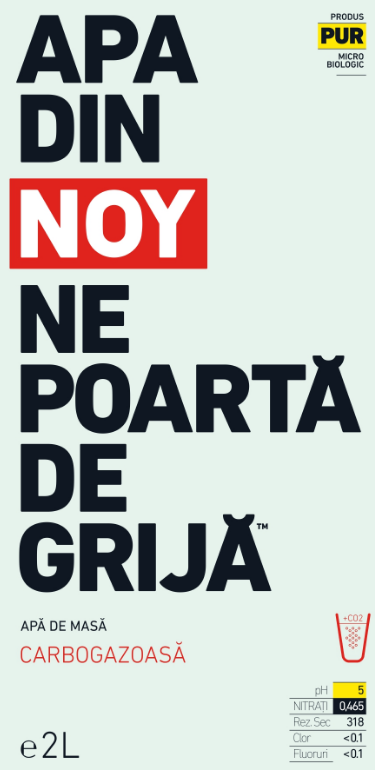
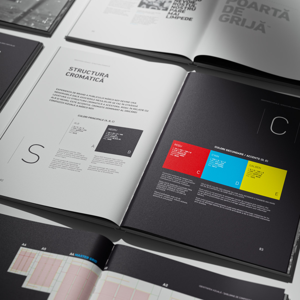
The resulting positioning was radically different from everything else in the category. NOY did not promise mountain purity or centuries-old tradition. It promised honesty, responsibility and a real relationship with the person drinking it, including transparency about its properties: pH and dry residue, communicated directly on the label, educating the consumer in a space where others chose silence.
Clarity
before
aesthetics
At the end of the Fuel phase, there were clear answers to three fundamental questions: what NOY is, who it exists for, and what sets it apart. A foundation on which to build.
Fuel Deliverables
Design Thinking Workshop
Opportunity mapping, audience definition, founding team alignment.
Competitive & Market Analysis
Local and international category analysis, opportunity zones.
Full Naming
Generation, filtering, semantic and legal validation, availability check.
Brand Strategy
Positioning, central promise, values, message architecture.
Identity Platform
Manifesto, voice, tone of communication, key messages.
Brand Brief
Concise strategic document, starting point for the design phase.
TRANSLATING THE CONCEPT
INTO VISUAL LANGUAGE
The central challenge of the design phase was clear: what does a brand that says “water belongs to everyone” look like?
does this serve communication, or does it merely decorate?
Every design decision passed through the same filter, which is this exact question.
A brand that defines itself through transparency could not afford to be ornamental.
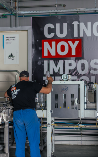
The label does something unusual for the category: it communicates. It does not hide behind images of mountains or springs. It visibly displays pH values and dry residue, data that other brands bury in small print or omit entirely. This was not an aesthetic decision. It was a brand decision: NOY had committed to educating the consumer, and the packaging was the first and most powerful instrument for doing so.
The design was optimised for the real shelf context. The packaging holds its own alongside established brands without imitating them and without becoming invisible. A firm, deliberate presence.
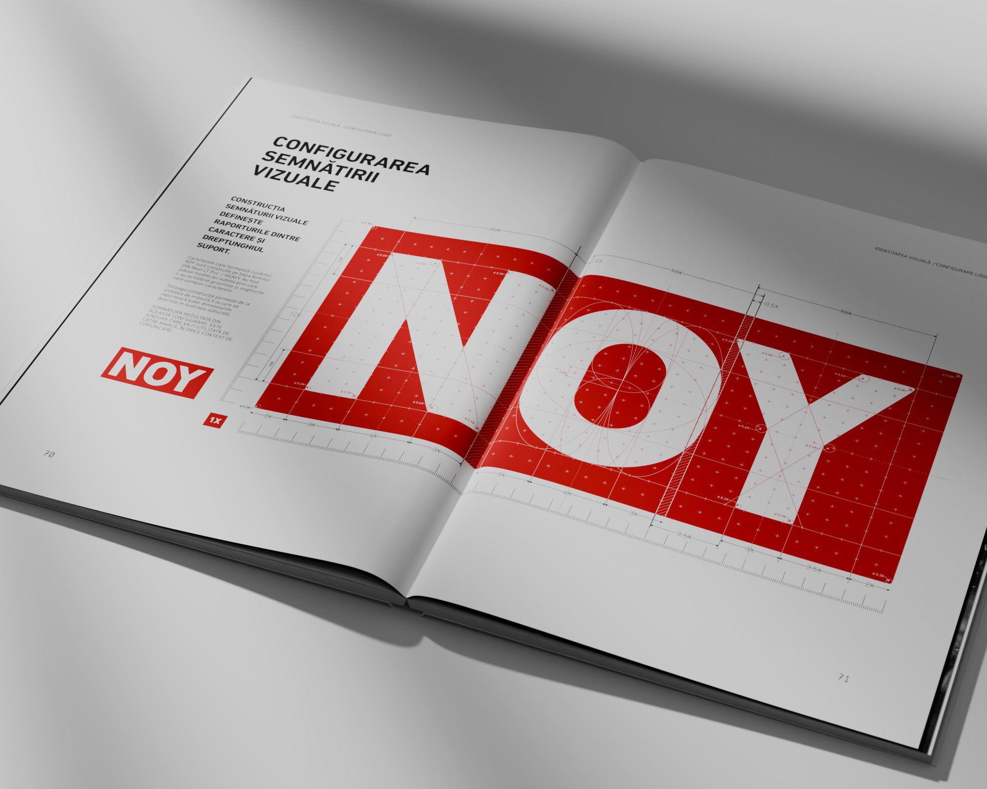
A brand that intends to grow needs a design system,
not just a logo
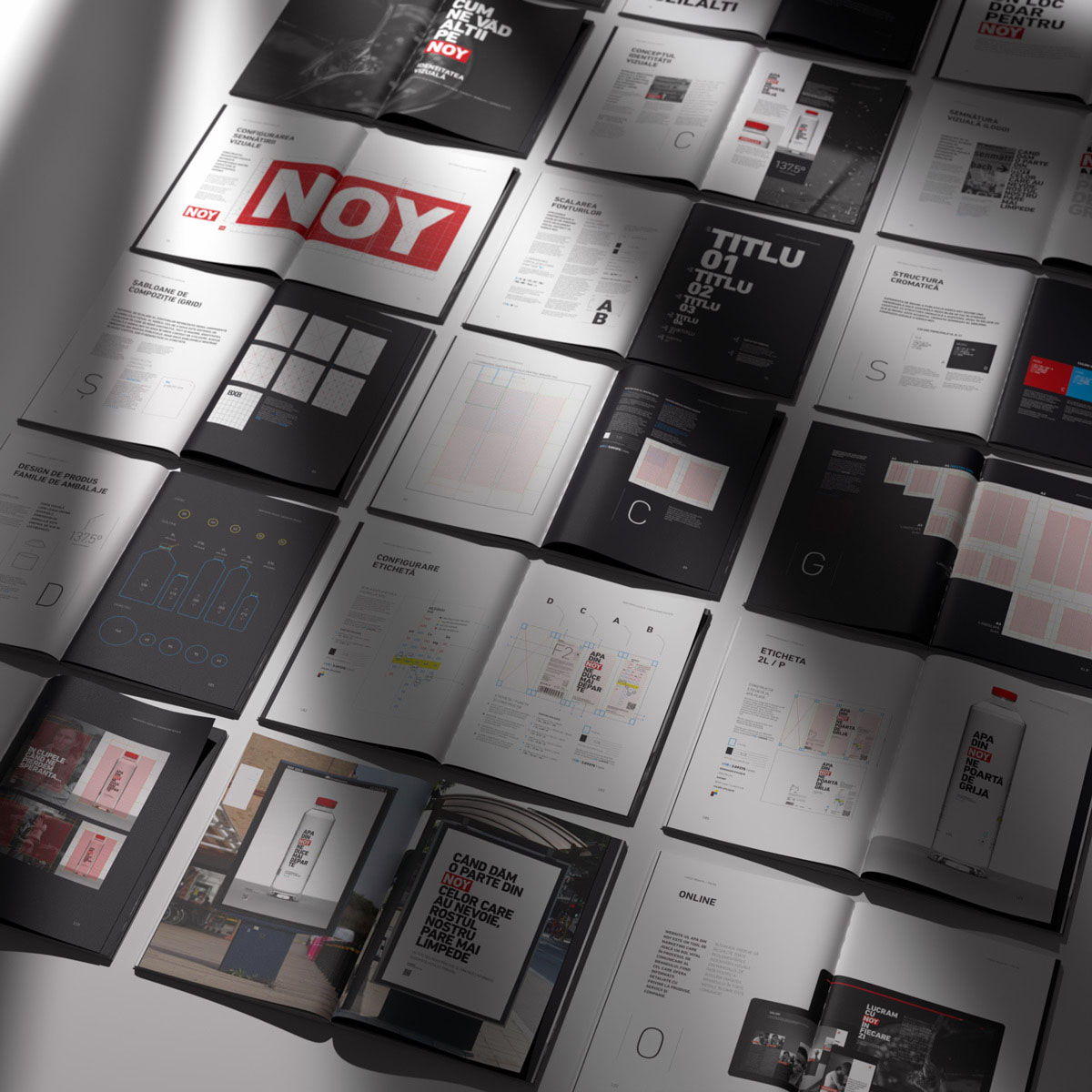
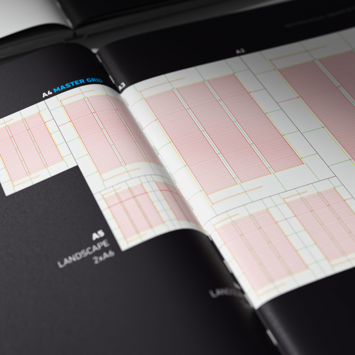
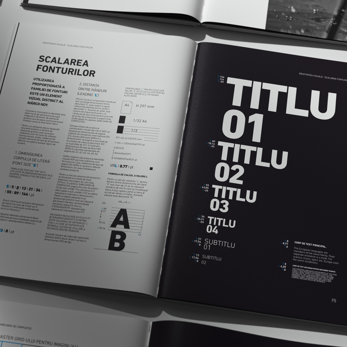
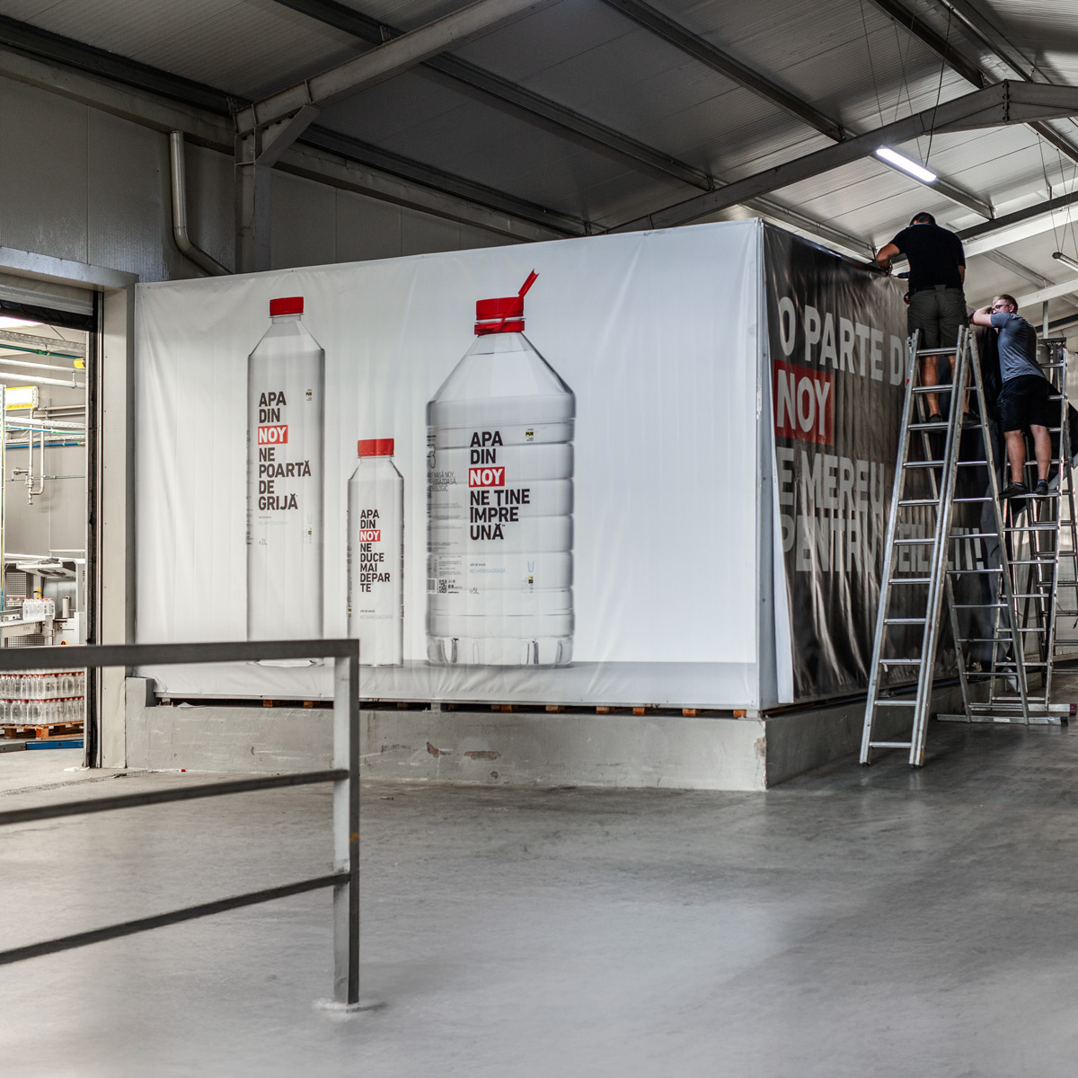
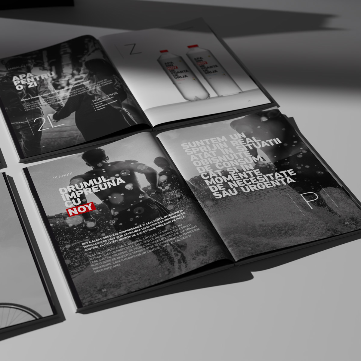
The NOY identity was conceived modularly: adaptable across all product formats (0.5L, 2L, 5L), across communication materials, digital platforms and any future touchpoint. The identity manual documents the rules and principles so that the brand remains coherent regardless of who applies it or in what context.
At the end of the Spark phase, NOY had a visual form grounded in solid brand strategy, and everything it needed to be disruptive on contact with the market.
LIVRABILE SPARK
Complete Visual Identity
Logo set, typography, colour palette, graphic elements, usage guidelines.
Packaging and Label Design
All formants, print-ready files, 3D mockups, production specifications.
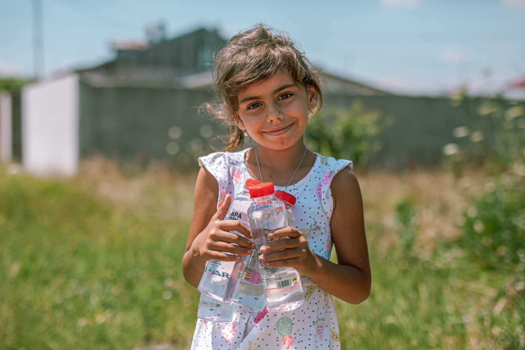
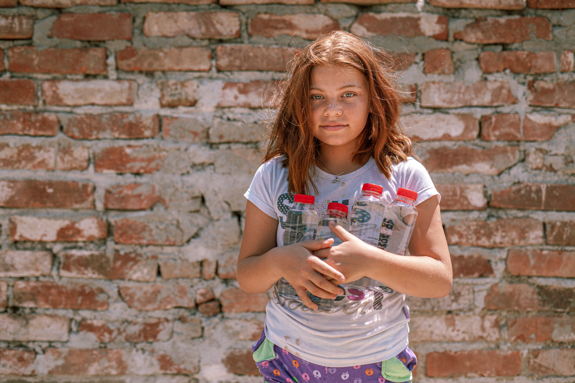
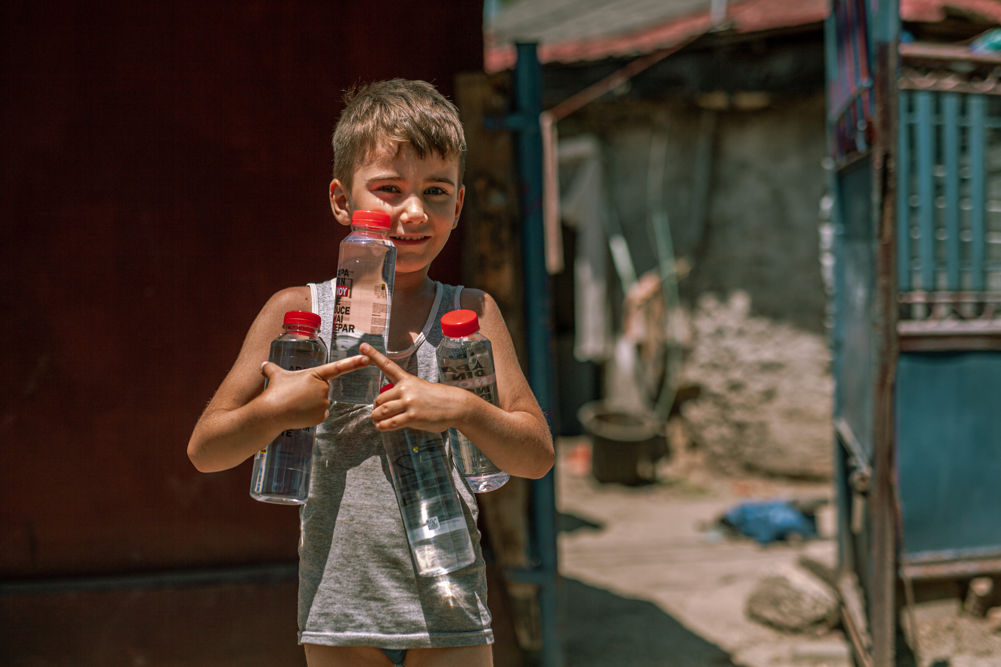
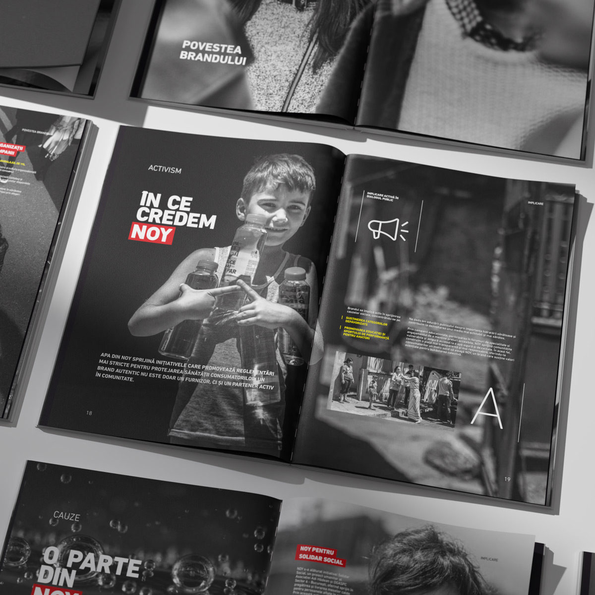
NOY built a significant part of its presence through concrete social actions.
"NOY will reach the glasses of those that other waters do not think about."
Water reached people affected by heatwaves, communities with limited access to drinking water, civic events. This was the direct consequence of what the brand had promised from the Fuel phase onward: “NOY will reach the glasses of those that other waters do not think about.” Presence at social causes over the years built a capital of credibility that no media campaign could have purchased. The people who received NOY in difficult moments know what that brand means, and they do not forget.
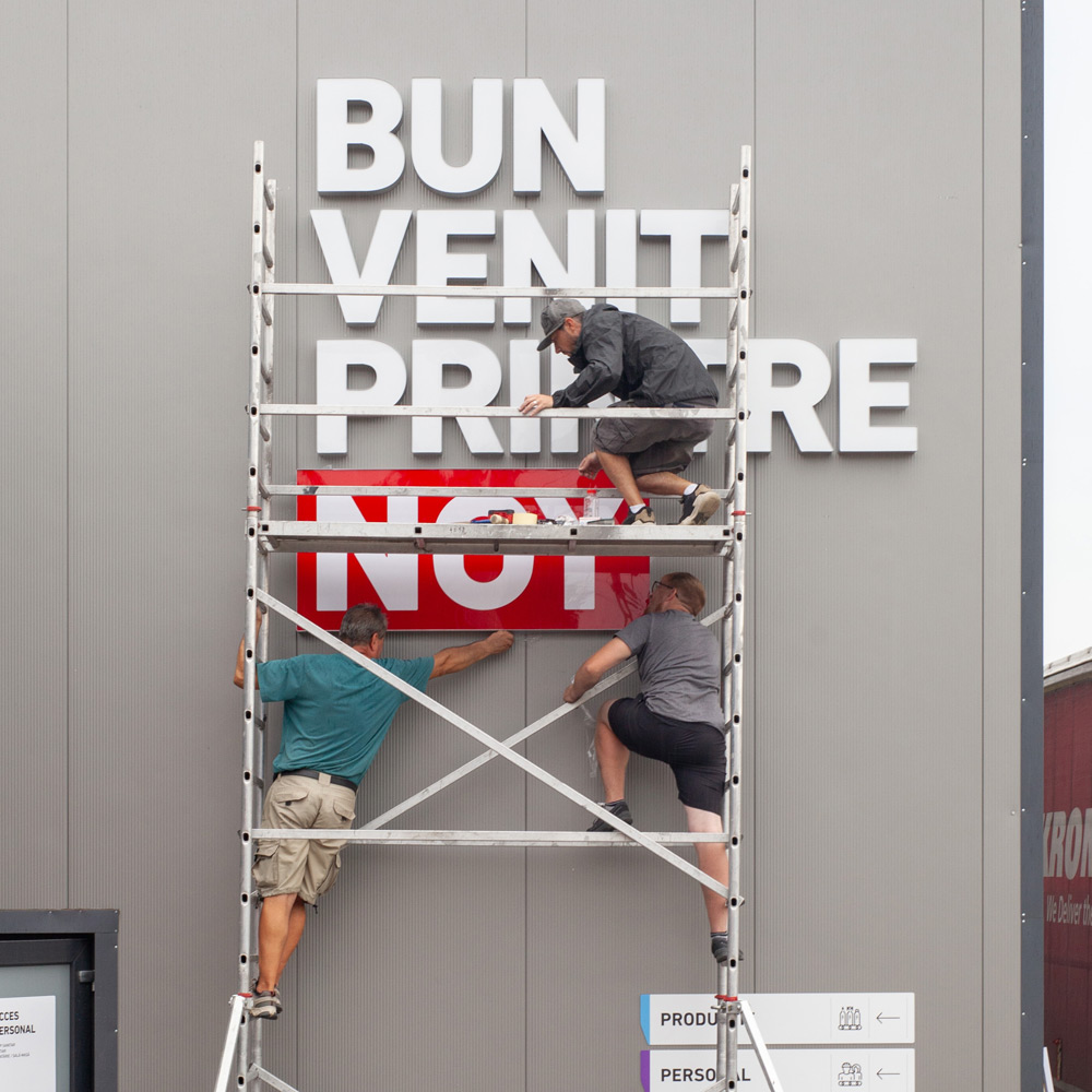
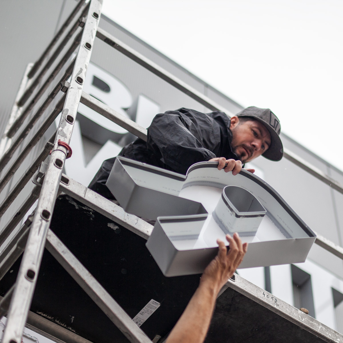
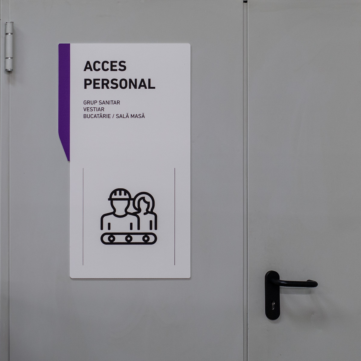
The identity was implemented coherently in physical space.
All built on the same visual system
Exterior signage
Interior signage
POS materials
RESULT
The coherence between what the consumer sees online and what they see on the shelf or in the street is not accidental. It is the result of an identity manual applied with discipline.
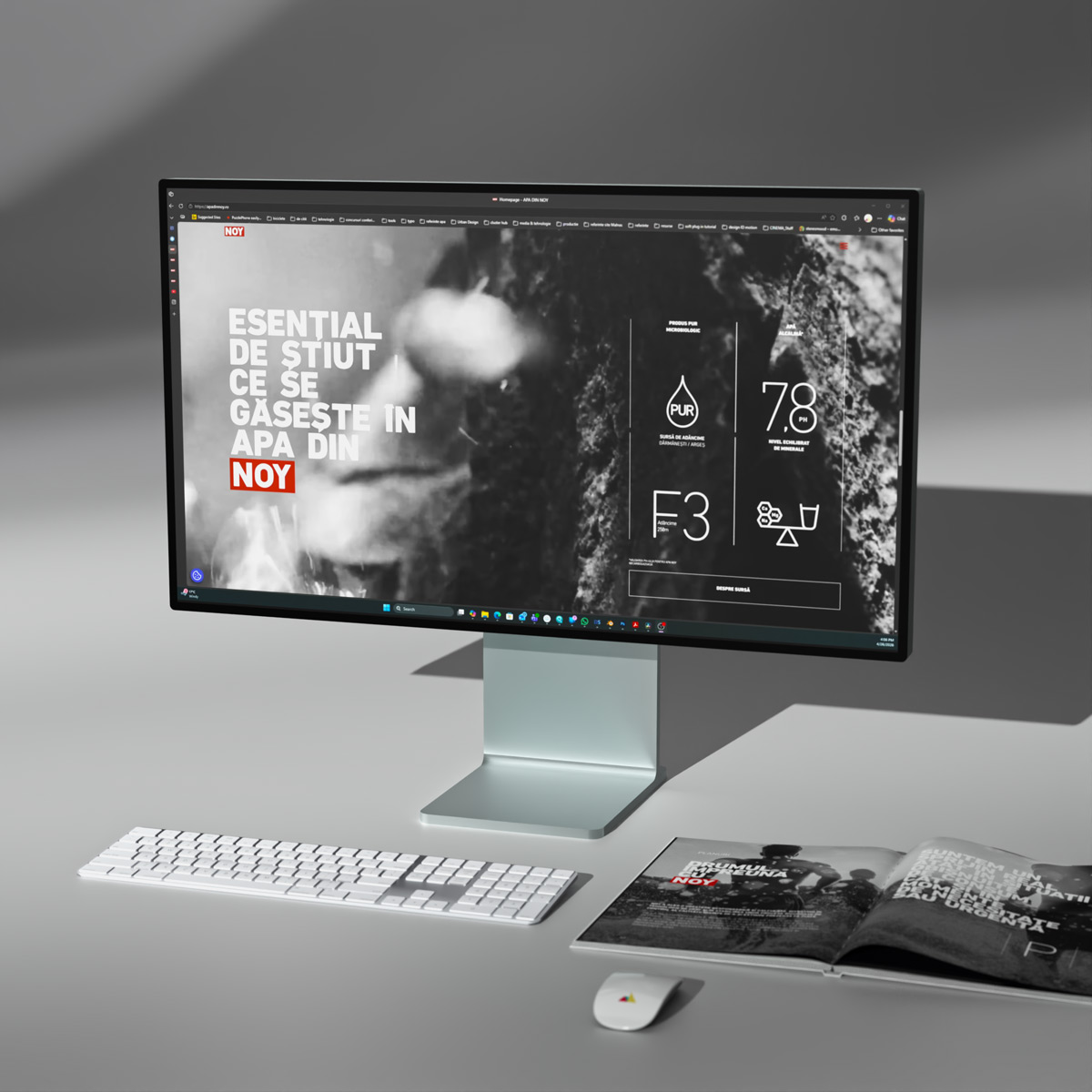
The new website represented the next step in consolidating the brand platform online.
This is a space that communicates the NOY identity, values and story with the same clarity found on the label.
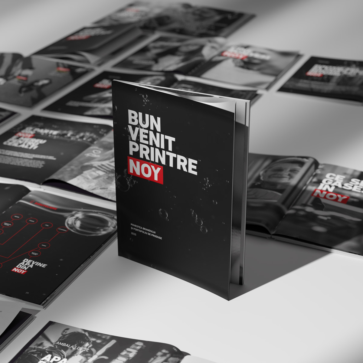
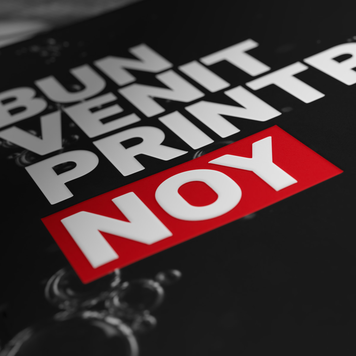
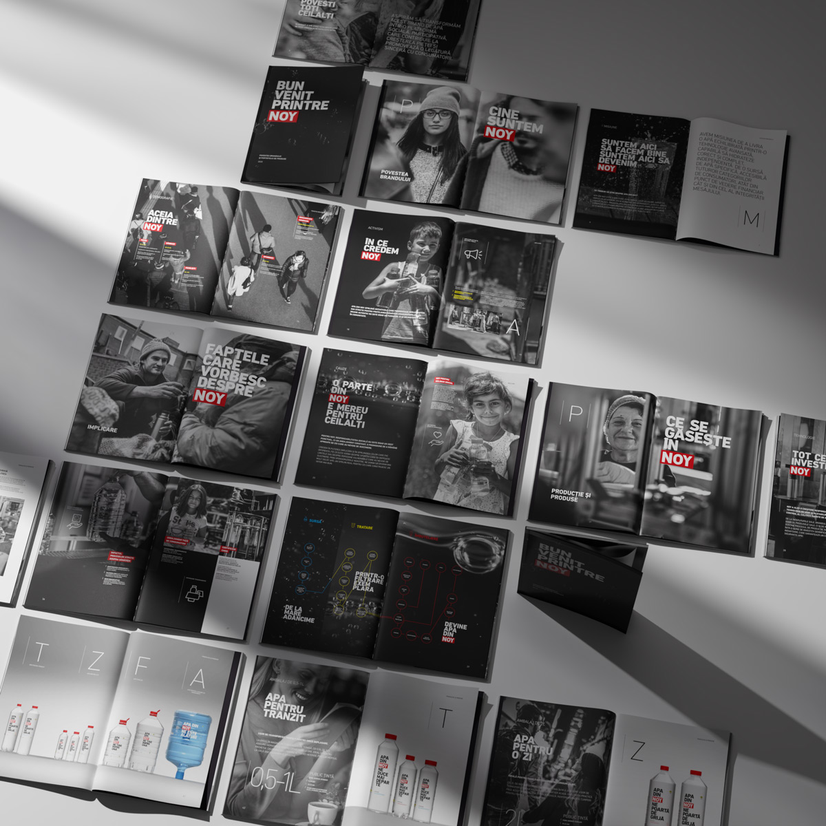
At the same time, the brand catalogue was developed as a coherent editorial and commercial tool, designed to organize information, product ranges, and communication directions into a unified system aligned with the brand’s visual and verbal identity.


