









APA DIN NOY
Bottled water, driven by social causes.
/
PRODUCTS
2014



From rebranding to transformation. How we built the brand platform of an international oil and gas operator and laid the foundation for a new identity.
The problem was not what the company did, but how it showed that it did it, because the brand identity was no longer keeping pace with the maturity of the business.
In a context where Expert Petroleum was speaking increasingly clearly about sustainability, long-term impact and operational responsibility (topics that mattered more and more to partners and international audiences), the brand expression had fallen behind. There was no coherent system to organize corporate communications, commercial materials and digital presence. The company’s operational complexity was not translated anywhere into a clear and credible presence. The rebranding was a strategic decision that went beyond an aesthetic need.

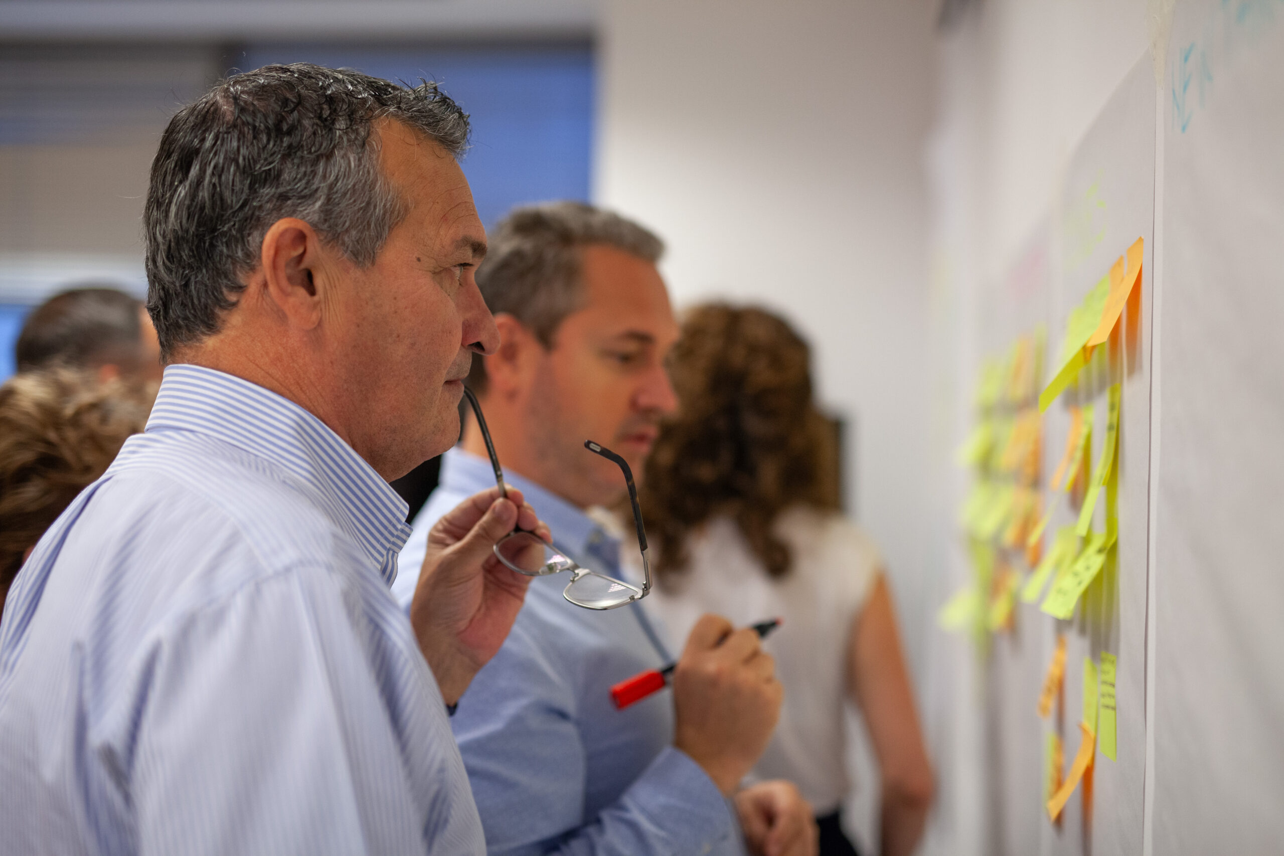
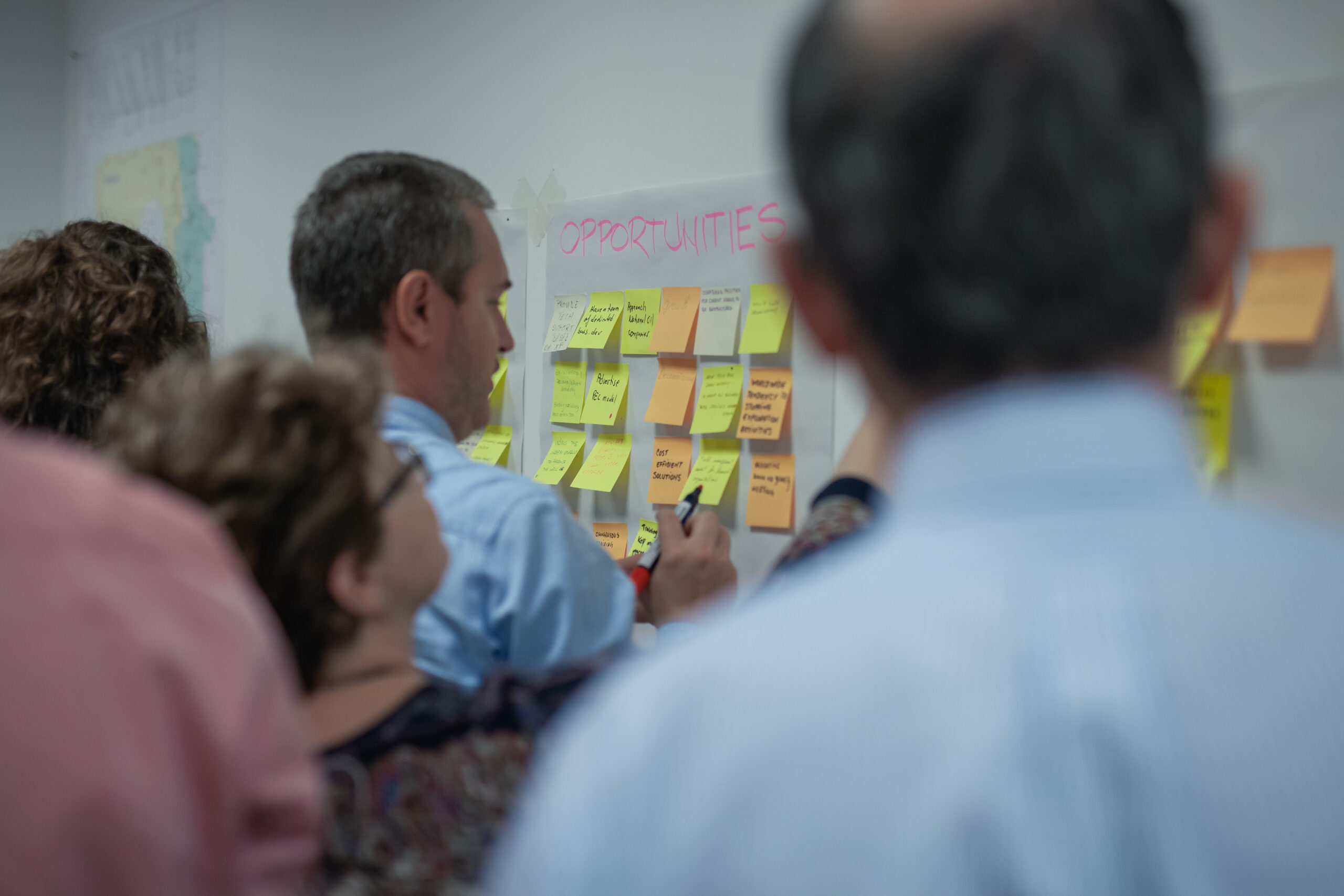
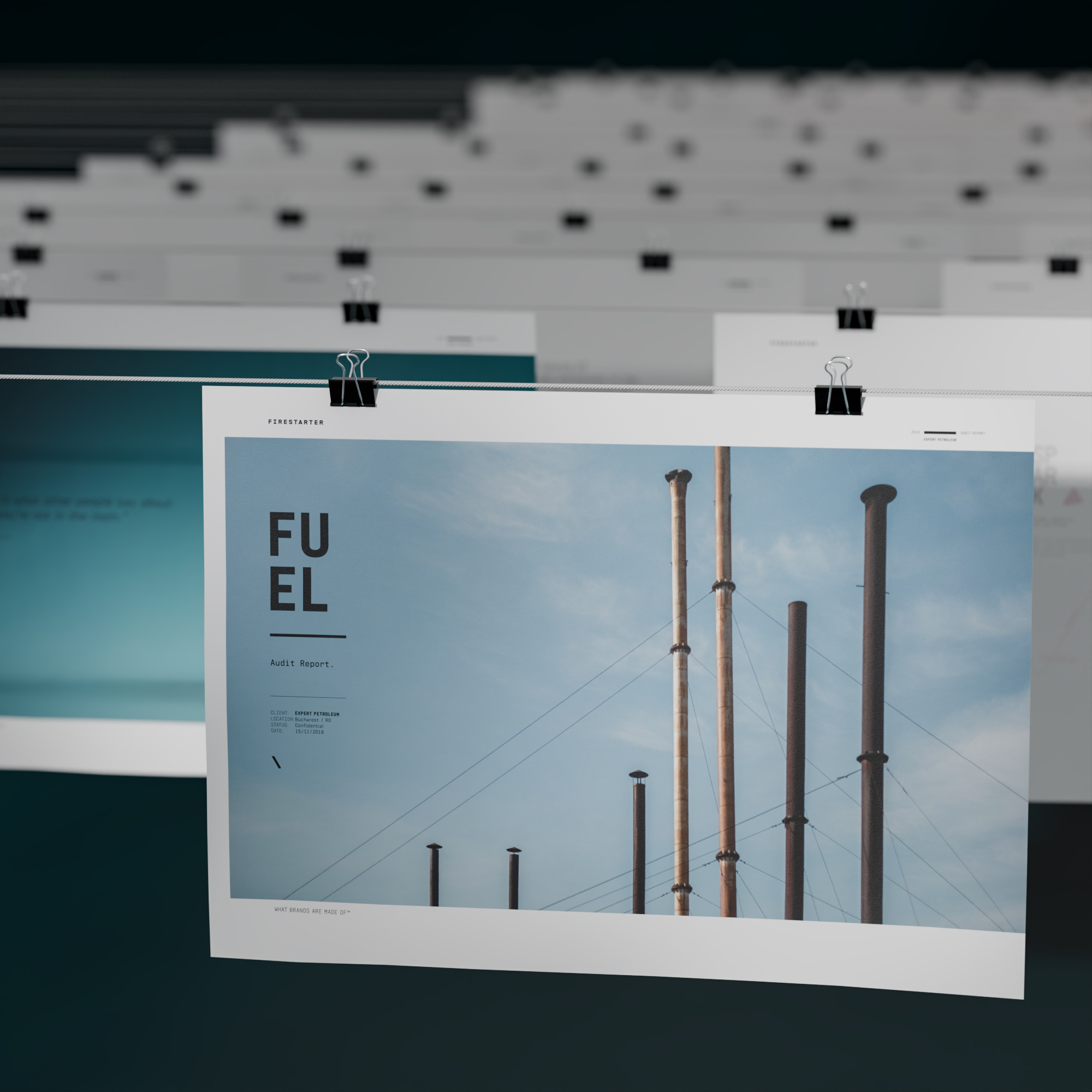
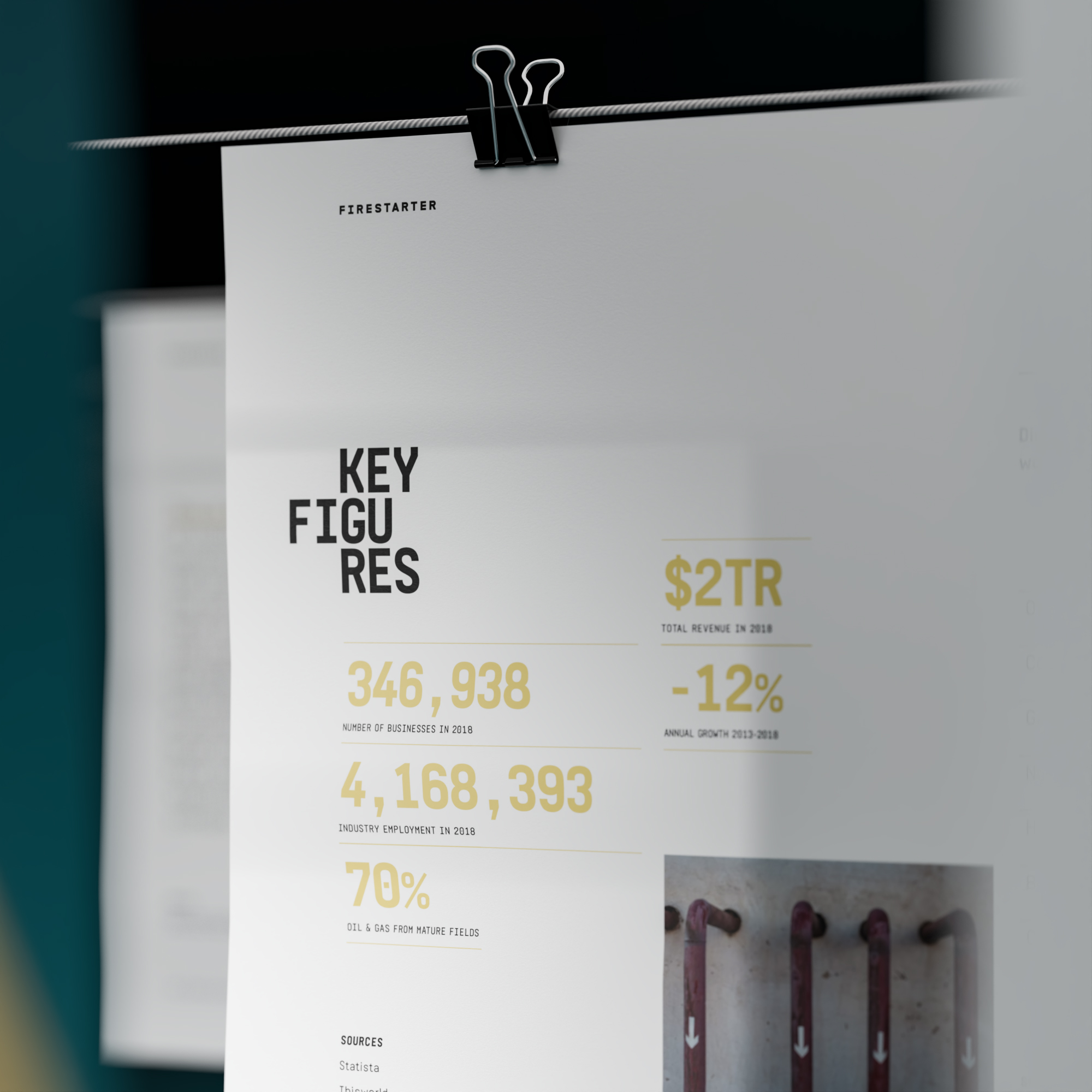
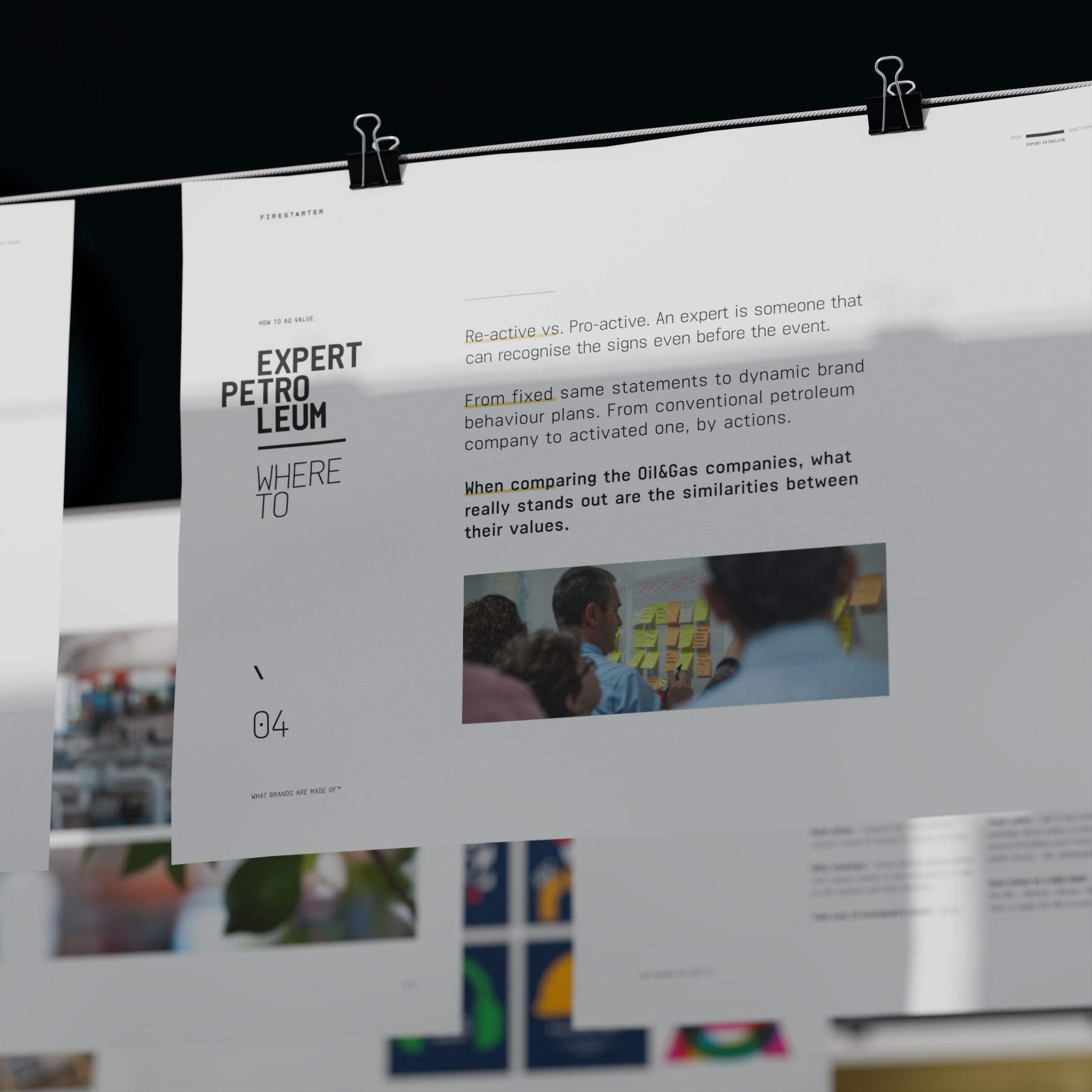
The audit started with a broader understanding. An extensive analysis of the industry context was conducted in parallel with Design Thinking workshops involving the extended management team.
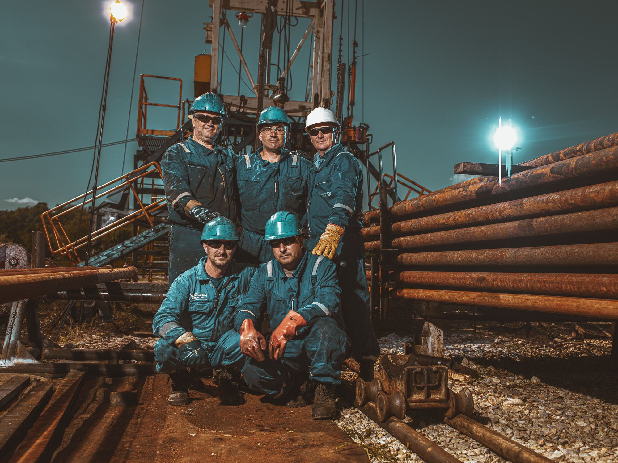
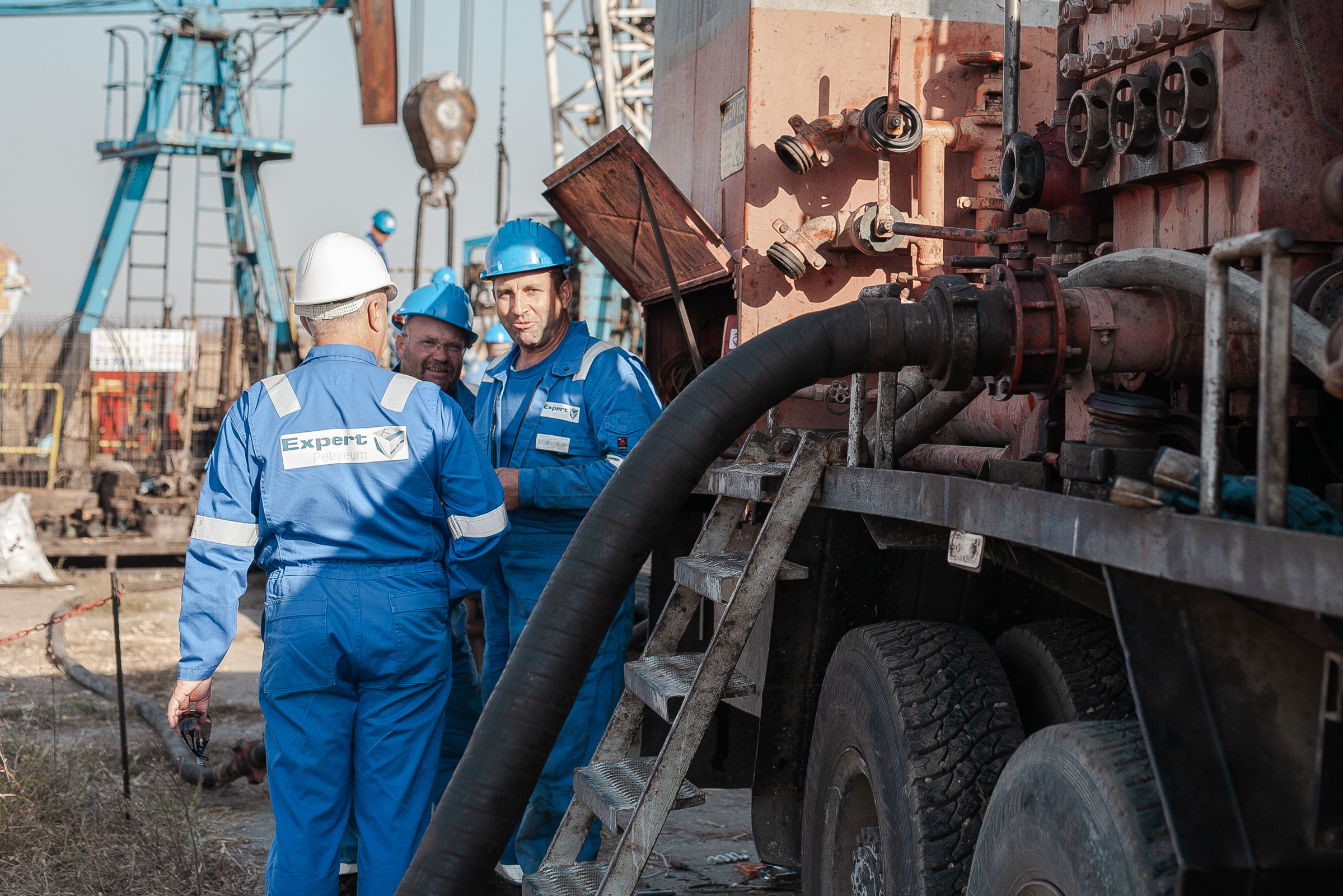
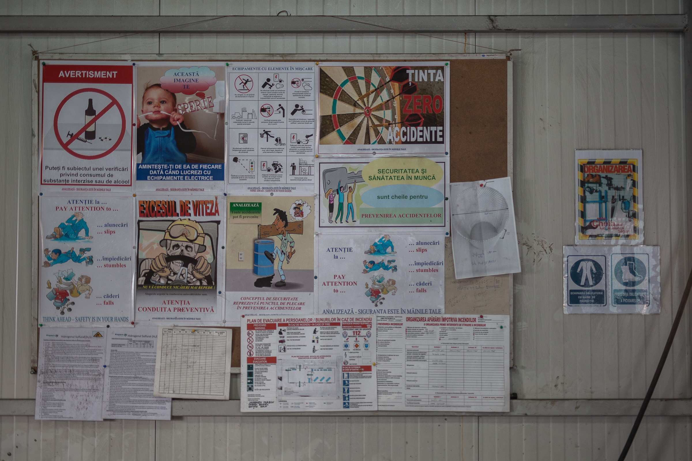
TO GET THE FULL PICTURE, WE STEPPED OUT OF THE OFFICE AND ORGANIZED PROSPECTING SESSIONS AT PRODUCTION SITES, WHERE WE WERE ABLE TO ASSESS WHAT WAS HAPPENING ON THE GROUND.
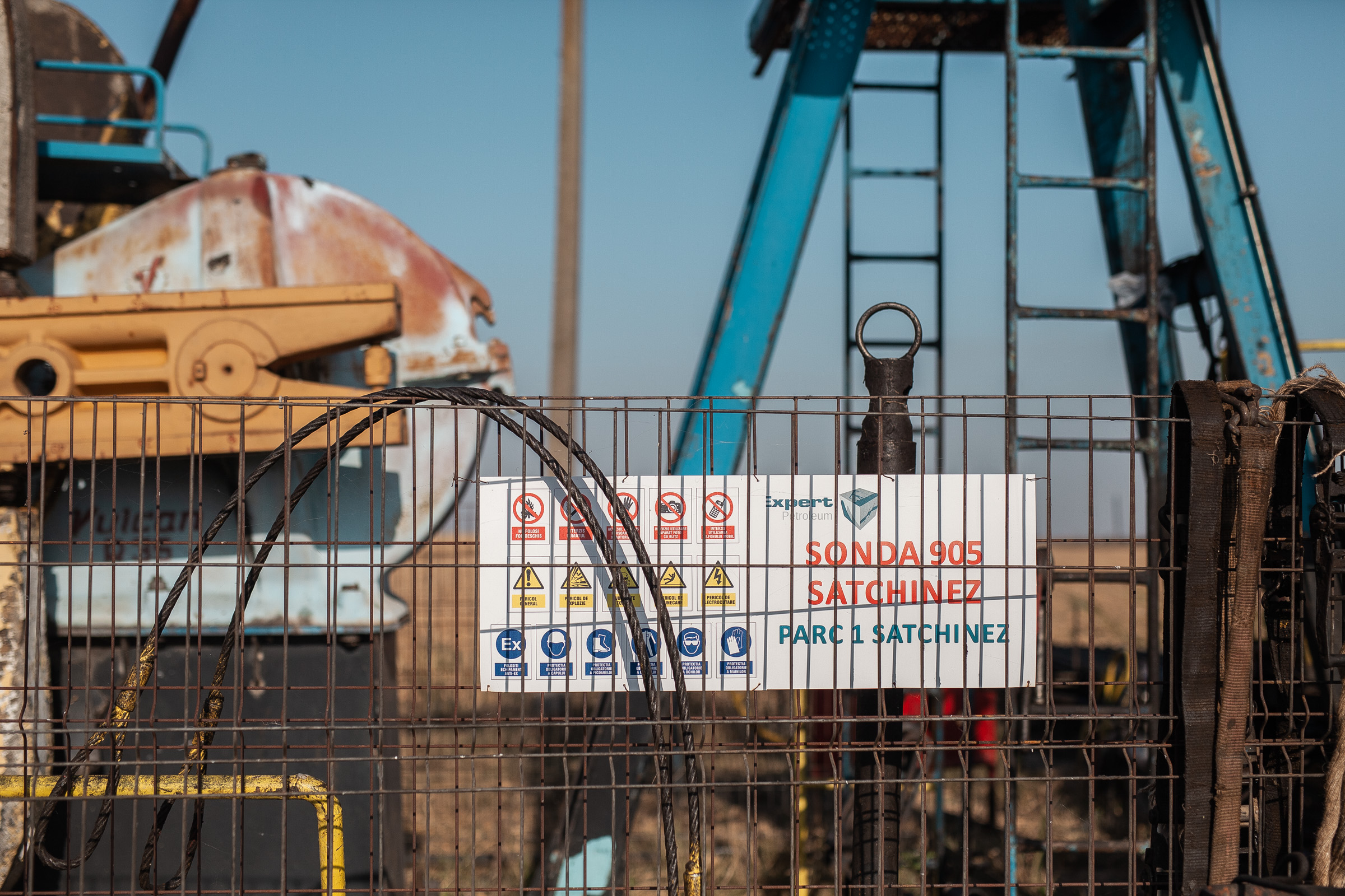
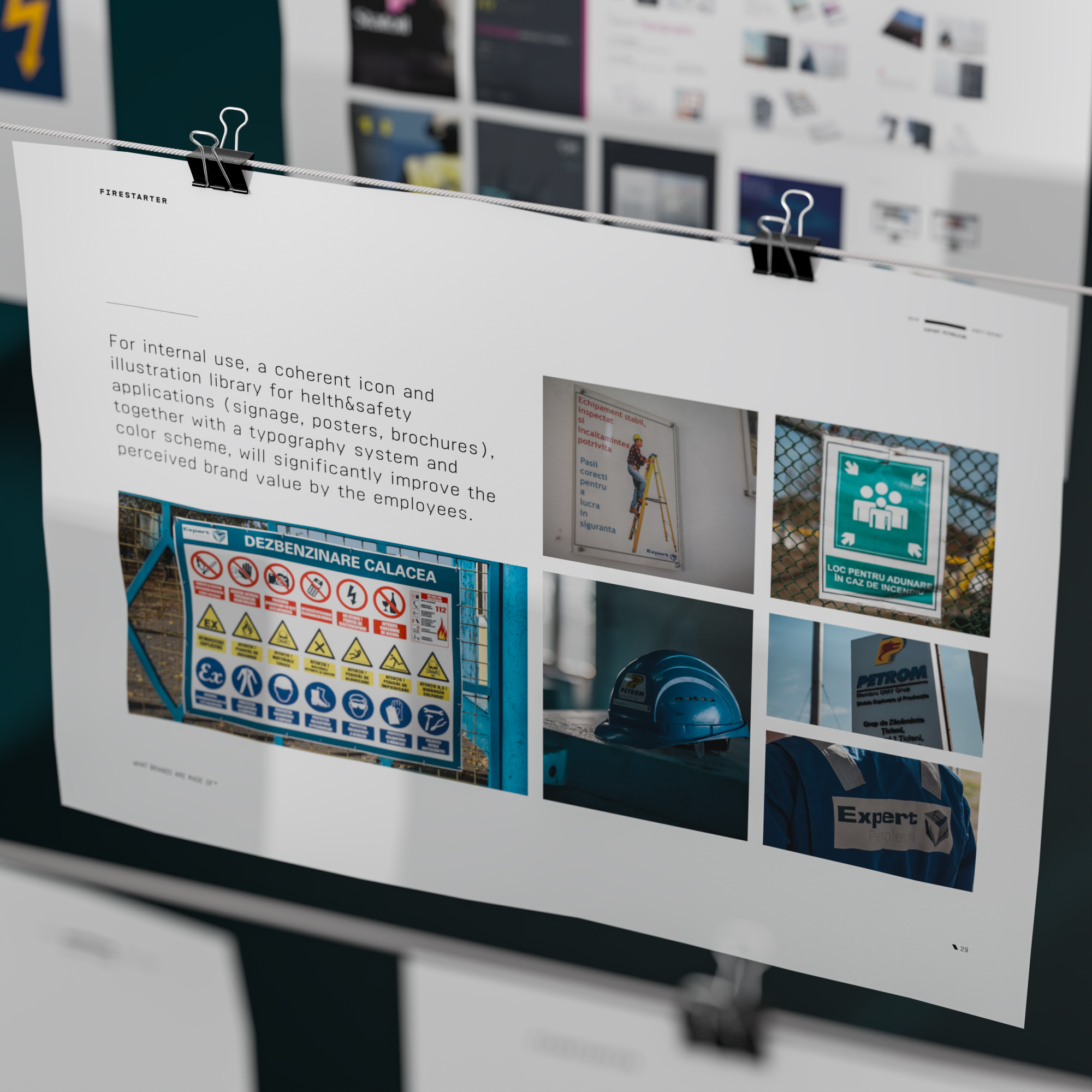
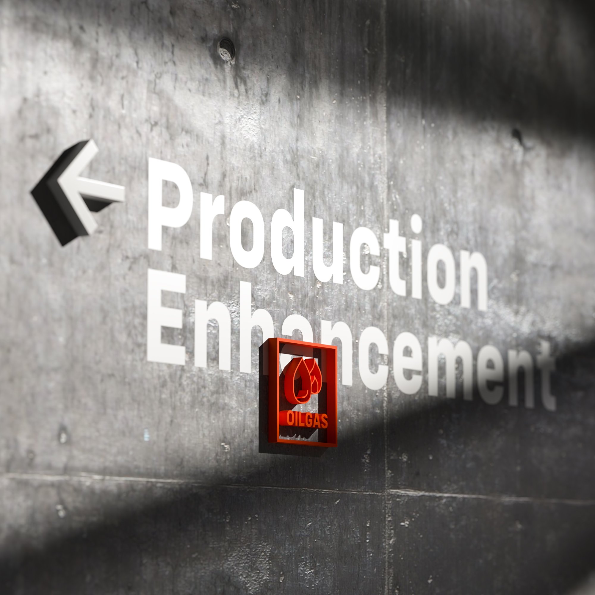
The interior and exterior signage, materials for field personnel, and the way the brand was understood and experienced by the people who represented it every day served as the “inspection” that showed us a brand system was needed.
Expert Petroleum was not lacking in values. Rigor, responsibility, and almost two decades of accumulated field expertise were already there. The problem was that none of these had been translated into a coherent language, embraced by everyone, regardless of whether you were in a negotiation room in Algiers or on a field in Argeș.
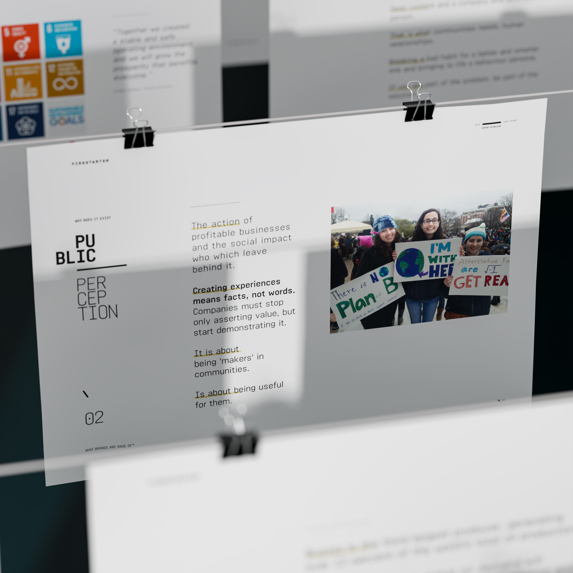
The oil and gas industry was under pressure from negative public perception. 100 companies were responsible for 71% of global greenhouse gas emissions, according to the Carbon Majors Database. In such a context, companies choosing transparency and responsibility were not only making an ethical choice but also gaining a real competitive advantage over those that would continue to communicate out of industrial inertia.
Expert Petroleum was precisely in that area of opportunity. It was a company with real values and responsible operational practices, but it was failing to make them sufficiently visible. The audit confirmed that the problem was not one of graphic execution, but of architecture and strategy.
Expert Petroleum had been successful precisely because the people inside the company knew what they were doing. But when the company needed to present itself in international negotiations, in relationships with partners outside the industry, and in conversations about sustainability and impact, its expertise was not reflected.
The existing identity had been built for a smaller company, with a more limited scope. It no longer supported the scale of an operator with offices in five countries, 15-year production enhancement contracts, and a publicly committed sustainability agenda. The gap between what the company was and how it looked was visible and created real friction in external communication.
The oil and gas industry largely communicates through statements, values, principles and commitments.
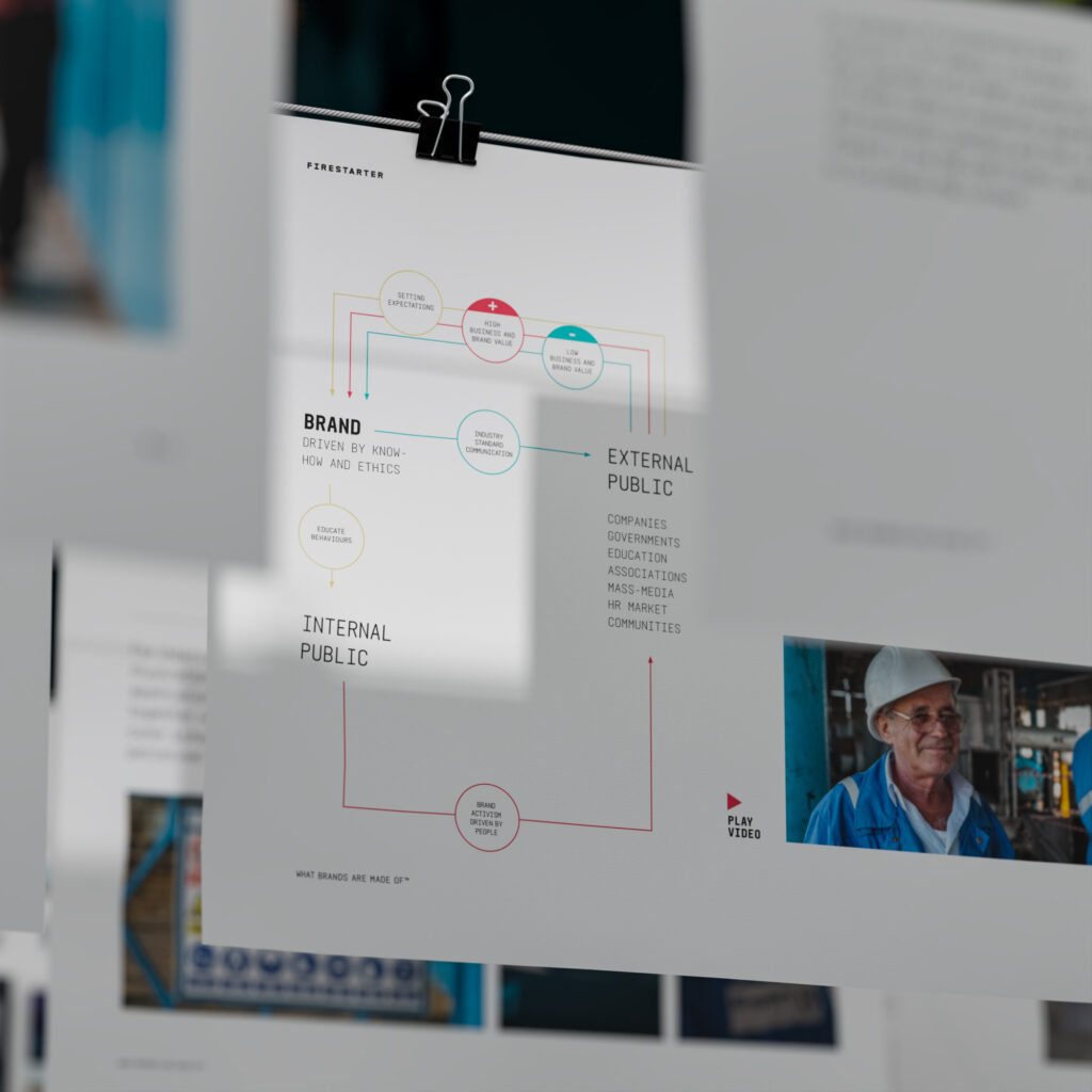
The Expert Petroleum brand strategy was built around this distinction. Beyond having a brand that claims to be responsible, it needs to be able to demonstrate responsibility through the way it operates. Mature field rehabilitation (more from an existing resource, with less impact), rigorous QHSE standards, active involvement in the communities surrounding operations, and concrete reductions in environmental footprint were the commitments around which everything the brand would come to represent was built.
The positioning articulated two essential dimensions of the company: proven technical expertise and long-term responsibility. These were not merely communication themes, but brand arguments grounded in the reality of the business.
The verbal identity was built in parallel with the strategic identity. XP’s communication style does not seek to replace the industry’s technical writing, but to complement it where the brand needs a voice of its own: headlines, sales materials, internal communications. The basic rule: 10% of any text can be different. That 10% is enough to make a brand recognizable.
The rebranding was conceived from the outset as a gradual evolution of the identity, allowing the company to preserve the equity built around the Expert Petroleum name while developing an expression for a later stage of growth.
The two identities coexisted for a period, creating a hybrid naming structure that allowed audiences to connect the established name with its new expression.
In parallel, we began introducing XP into internal communication, gradually turning the contraction into a natural language reflex. In the pronunciation of the word Expert, the initial E does not add an additional sound: the X is already pronounced “ex”. Therefore, the contraction of Expert Petroleum into XP did not arbitrarily remove part of the name, but retained what was already essential to its pronunciation. As a result, words such as eXPerience, eXPansion, eXPloration, eXPectation and eXPedition became some of the first ways to visibly activate the XP particle in internal communication. This was a way of connecting the brand’s new expression to the attributes and behaviours the company wanted to reinforce: accumulated experience, growth, exploration of new possibilities, anticipation and the ability to move forward.
The contraction that had initially been introduced gradually as a secondary expression thus became the company’s primary identity.
This evolution also responded to a broader strategic need. As the oil and gas industry became increasingly associated with environmental impact, the term “Petroleum” carried increasingly heavy semantic associations within the name. For Expert Petroleum, whose business model was built around optimising mature fields, extending the life of existing resources and reducing the impact of operations, it was important for the identity to communicate more directly what the company did, rather than simply the industry it operated in.
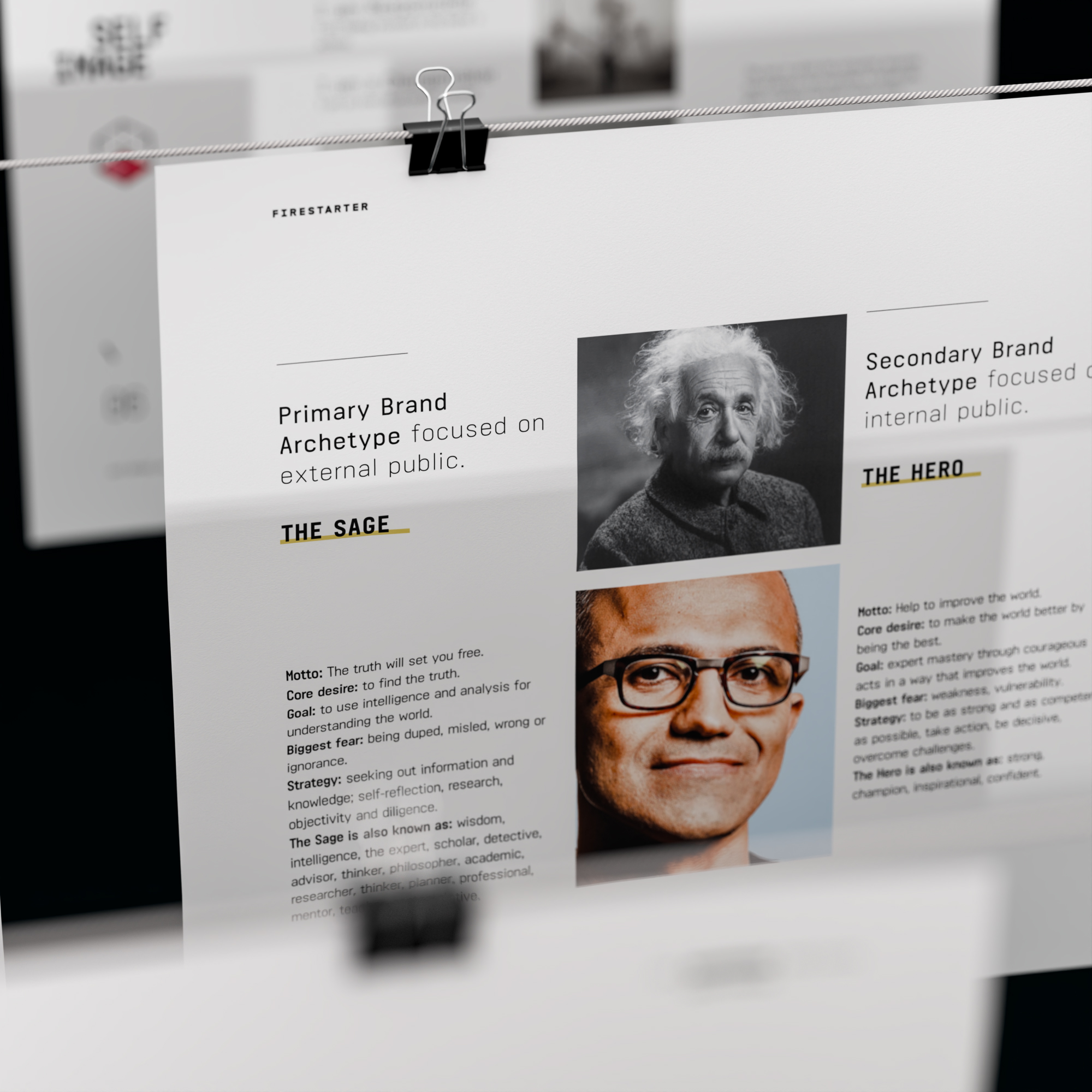
One of the central tools of the Fuel stage was building the brand personality.
For Expert Petroleum, two complementary archetypes were identified, each addressing a different audience segment.
The primary archetype, addressed to external audiences: Oil & Gas companies, governments, institutions, international partners. The Sage seeks truth, operates based on deep knowledge and rigorous analysis, and detests ignorance and superficiality. Its motto: “The truth will set you free.” Expert Petroleum means an operator that knows more than the client does, recognizes the signs before an event occurs, and provides solutions based on data, not intuition.
the secondary archetype, addressed to internal audiences: field teams, employees, local communities. The Hero takes action, overcomes challenges, rises to the occasion and inspires through example. Its motto: “Help to improve the world.” Expert Petroleum means people who work in difficult conditions, in mature fields that others have abandoned, and who find solutions where others see only problems.
Evaluation of the existing identity, analysis of communication materials, identification of the gaps between the brand expression and the business reality.
Analysis of the oil and gas category at a local and international level, mapping of the competitive discourse, identification of opportunity areas.
Defining the positioning around two axes: proven technical expertise and responsibility towards communities and the environment. A brand built on facts, not statements.
Brand essence, manifesto, values, voice.
Primary archetype for external audiences and secondary archetype for internal audiences.
Concise strategic document, starting point for the design phase.


The strategy defined what Expert Petroleum needed to communicate. The Spark stage resolved how, through an identity concept that would express everything that had been strategically built in FUEL.
The central concept behind the Expert Petroleum identity started with a philosophical question: what does evolution mean for a company operating beneath the surface of the earth? The answer came through a concept we called Transcendence. Rehabilitating a mature oil field means seeing potential where others see only decline. It means transforming matter into motion, extracting more from a resource with less impact, and making something that appears depleted work again. The concept captured this logic and gave the design a clear direction.
The concept also anchored the company’s vision: “A world made better from the inside out.” The idea of going deeper and improving from within was a natural parallel to Expert Petroleum’s business model. This philosophy was translated into the identity through a system built around two fundamental graphic elements: the teal square and the orange dot. The teal square represents the raw oil resource, while the orange dot represents the energy generated through the transformation of the resource (gas and fuel). Together, they express the idea of transcendence: the transition from one form of resource to a new form of value.
In the identity animations, multiple dots represent the data and information collected from resources and operational processes. As they become connected, relationships and structures emerge. Data becomes knowledge, and knowledge becomes expertise. In this sense, the identity also incorporates The Sage archetype: the expert who is not defined by the amount of information they possess, but by their ability to interpret it and transform it into applied wisdom.
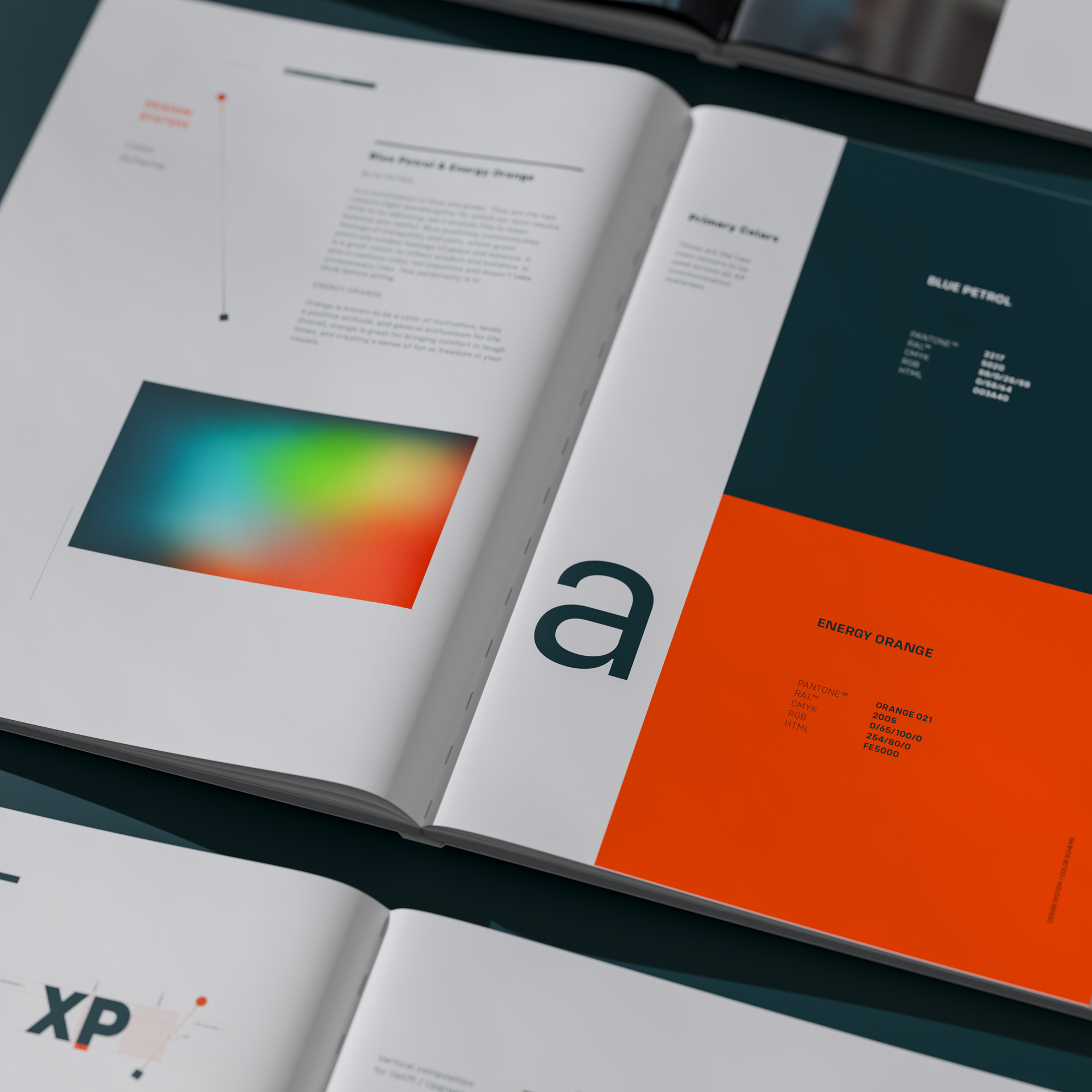
One of the most coherent aspects of the Expert Petroleum identity is the direct connection between the archetypes and the colour system, a decision that transformed the colour palette from an aesthetic choice into a strategic argument.
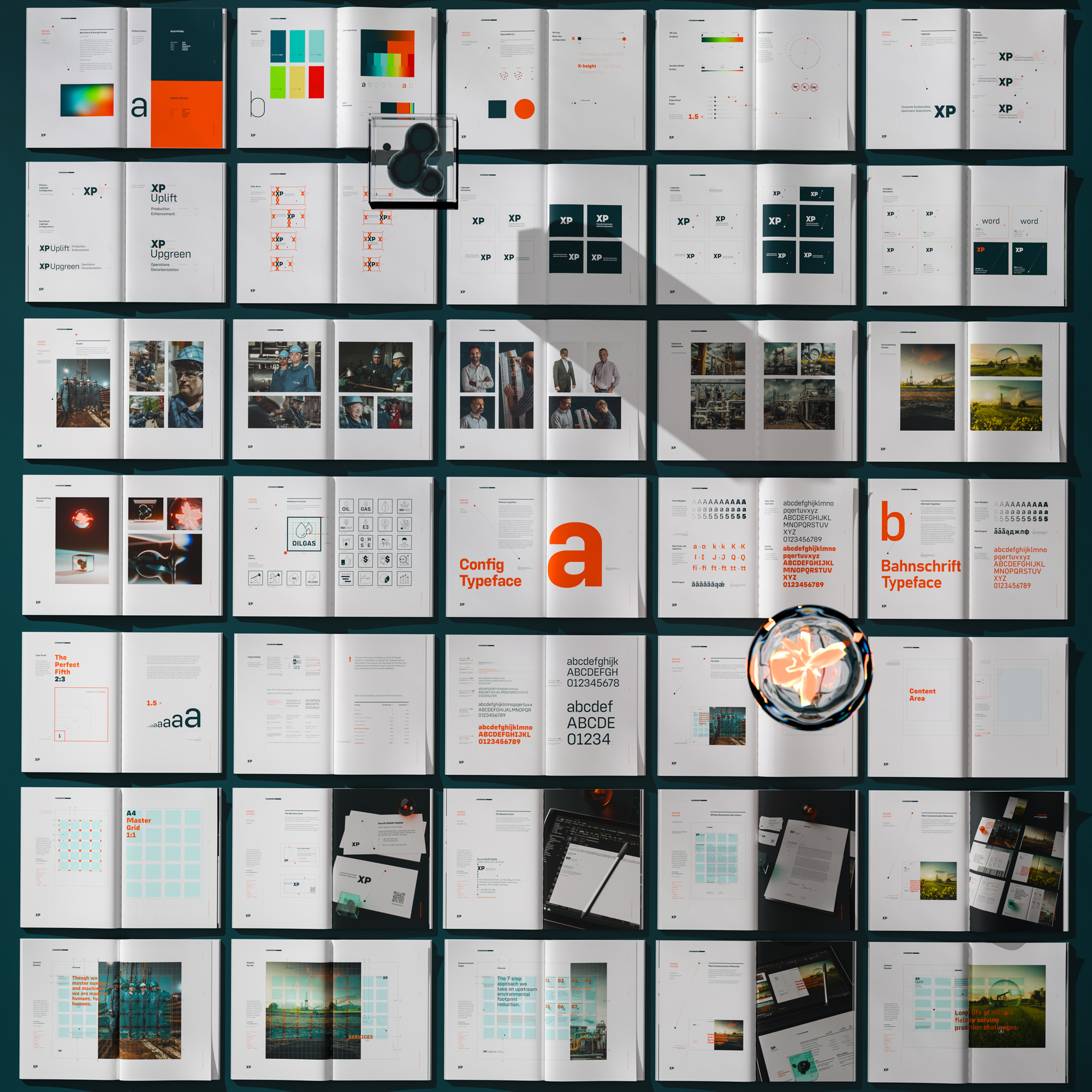
A combination of blue and green, the wavelengths for which the human eye requires no adjustment. It communicates wisdom and calm, thinking before action, prudence. It is the colour of a brand that knows what it is doing and thinks before it acts.
Motivation, enthusiasm, comfort in difficult moments, a sense of freedom. It is the colour of the people in the field, of those who take action, of those who make a difference through concrete effort.
The color system thus created a clear and functional separation: teal for external, corporate and partnership communications, and orange for internal communications, people, field operations and communities.
A specific element of the identity, the system of dots and squares that form modular structures, was designed to visually express the logic of the concept. Simple elements that, in combination, create complex and continuously evolving structures formed the basis for the brand animations, which transform existing resources and move forward into new value.
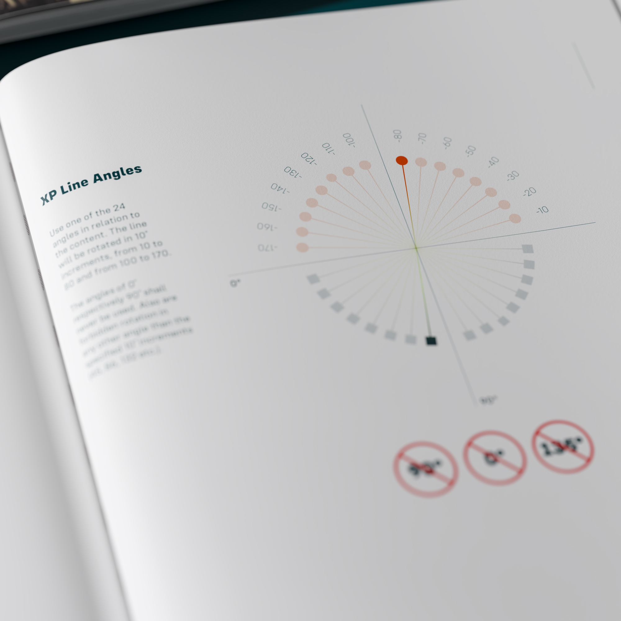
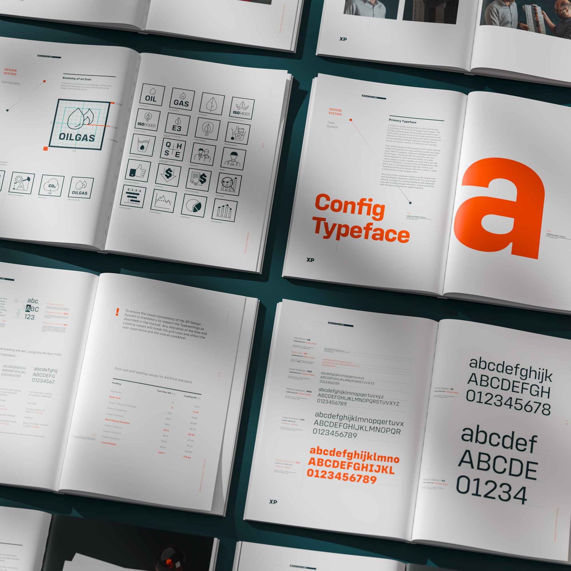
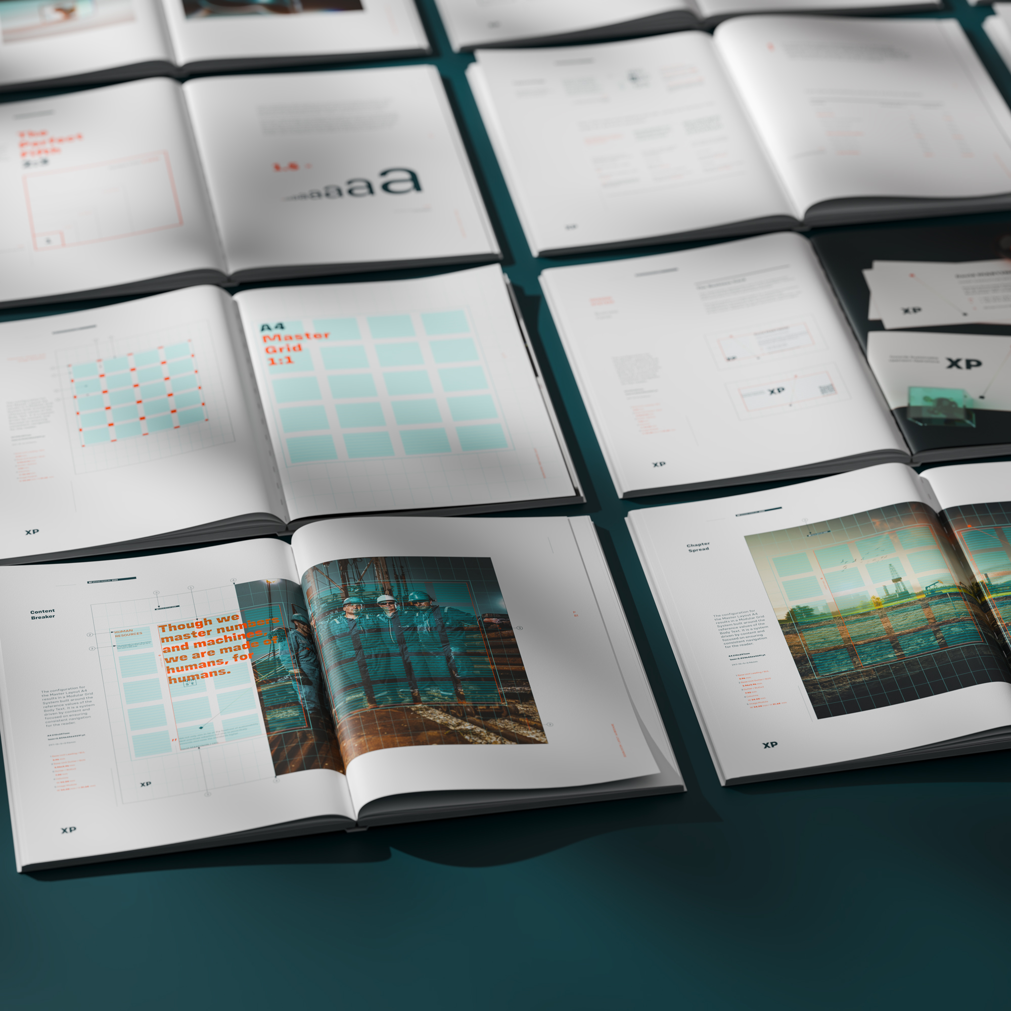
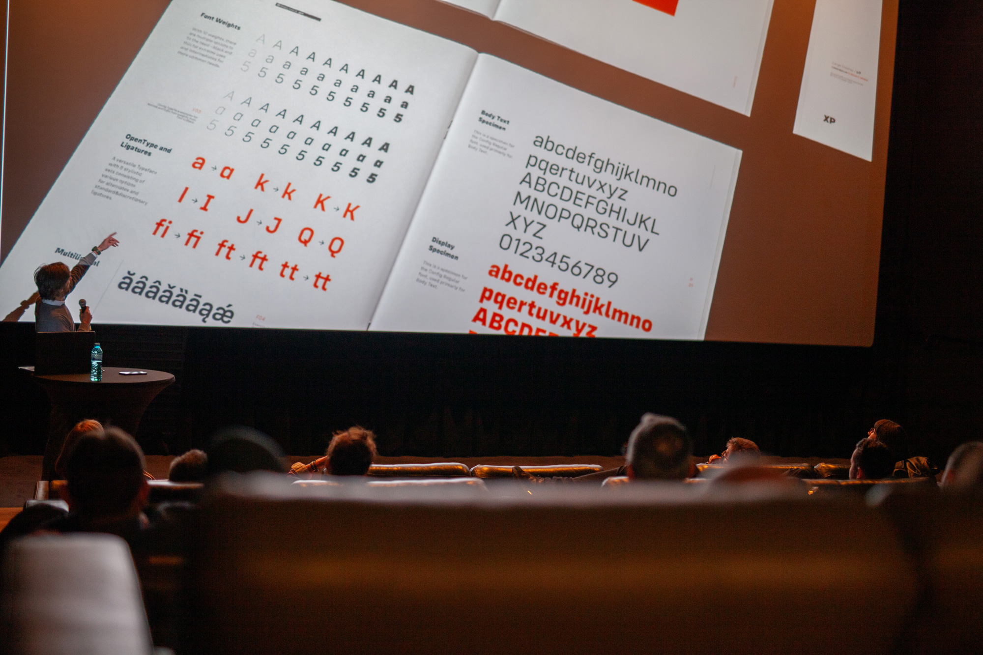
visual signature, color structure, typography, iconography, layout
complete usage manual, implementation rules, component library
stationery, corporate and commercial templates, presentation formats
verbal identity, audience-specific messages, applied tone of voice
architecture, wireframes, prototyping, page design
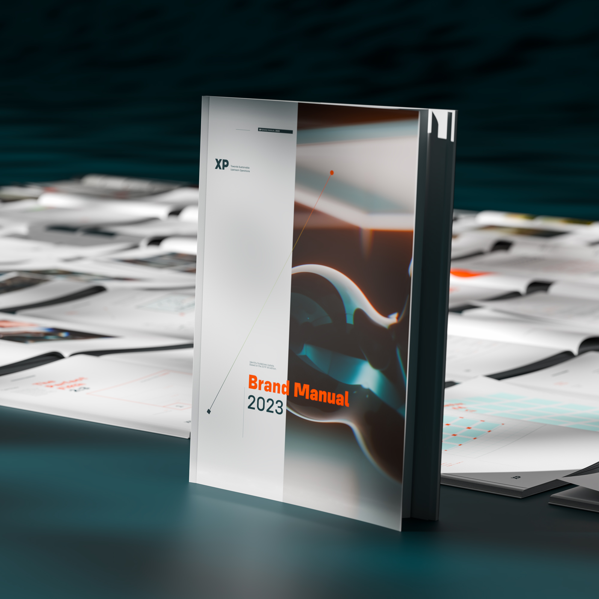

The Oxygen stage transformed the rebranding from a completed project into an active tool. The new identity began to function effectively across all of the company’s touchpoints and, over time, prepared the ground for Expert Petroleum’s most important decision – the transformation into XP.
Before Expert Petroleum could be perceived differently by partners and clients, it needed to be understood differently by its own team, from executive management to people in the operational fields. The Brand Implementation Workshop sessions ensured that the team understood not only what the new brand looked like, but also the logic behind every design and communication decision.
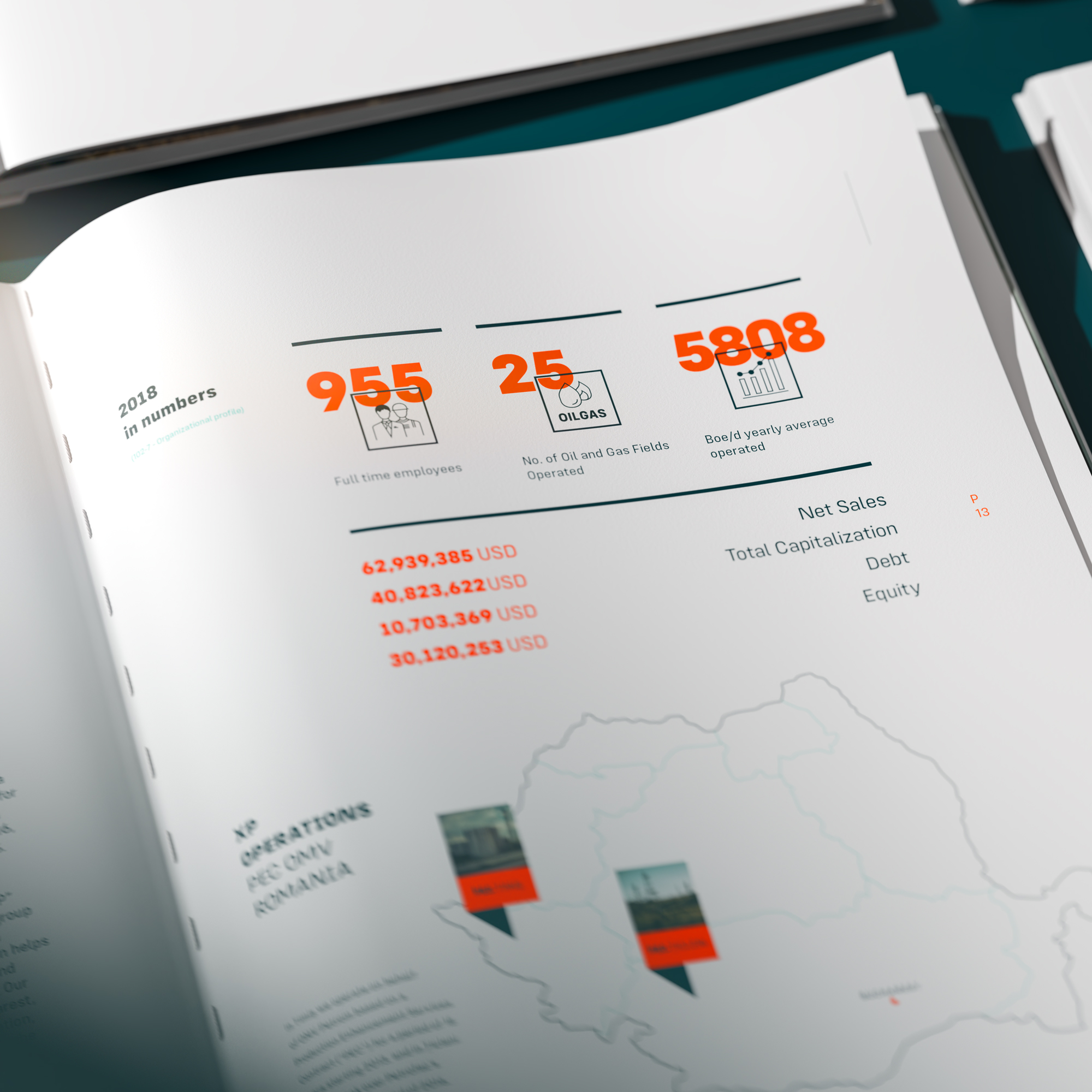
The company had committed to concrete targets: a 75% reduction in greenhouse gas intensity, a 40% reduction in the footprint of its activities, a 25% reduction in leaks, a 45% optimization of Opex, and a 60% reduction in fresh water consumption intensity. These were operational KPIs. The Firestarter’s mission was to take them out of technical reports and transform them into a visual and editorial brand narrative.
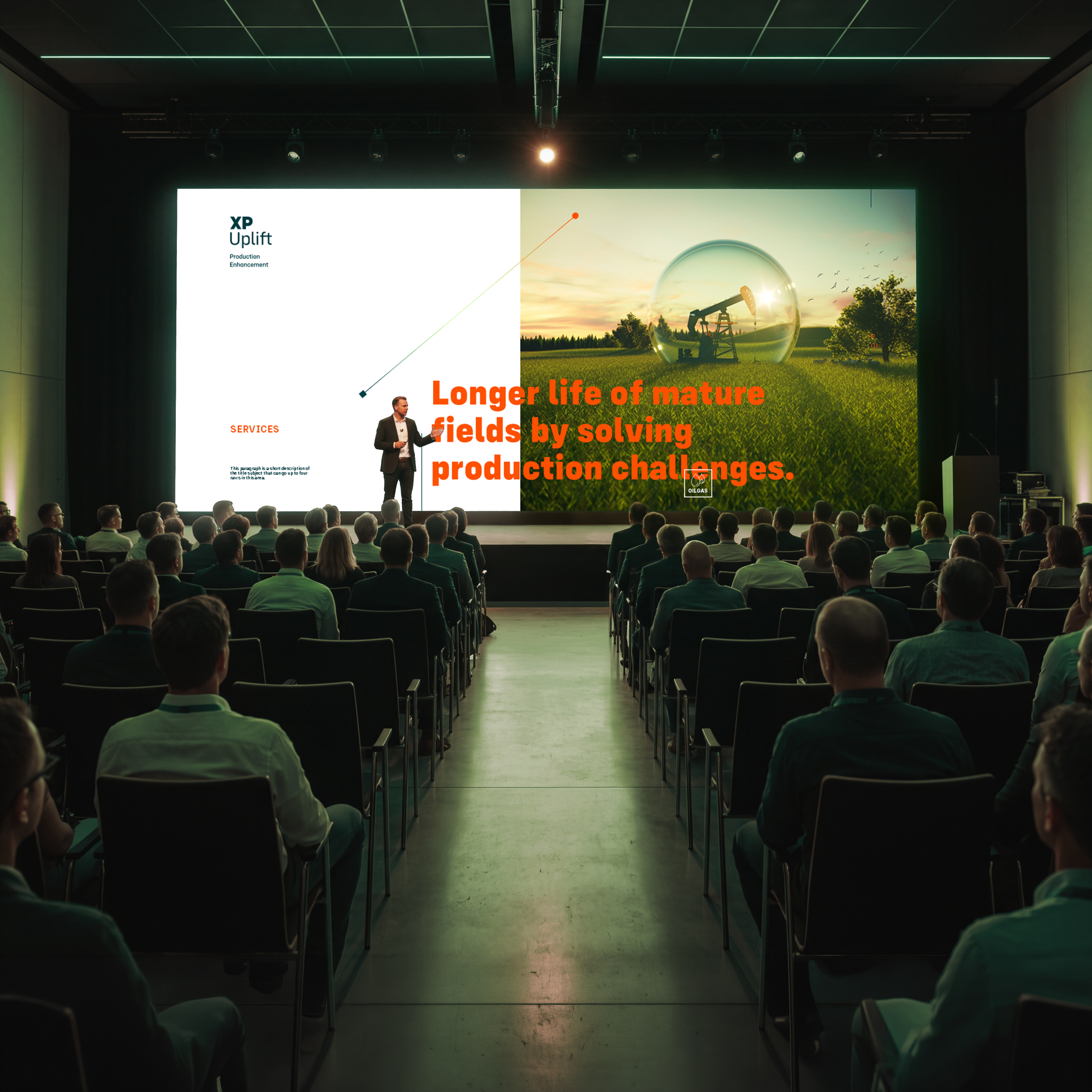
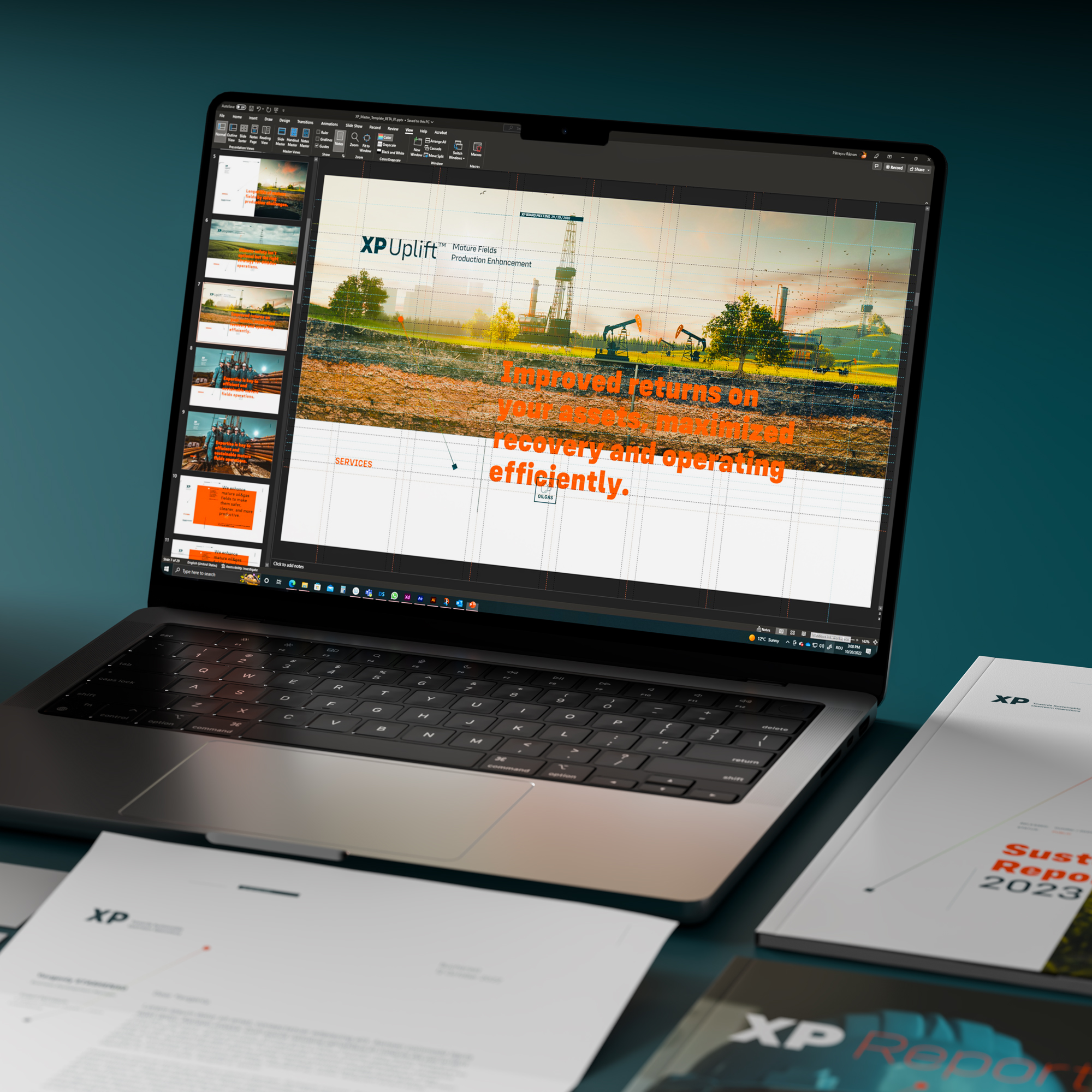
The physical implementation covered all relevant touchpoints: corporate materials, signage, presentation assets, and digital adaptations.
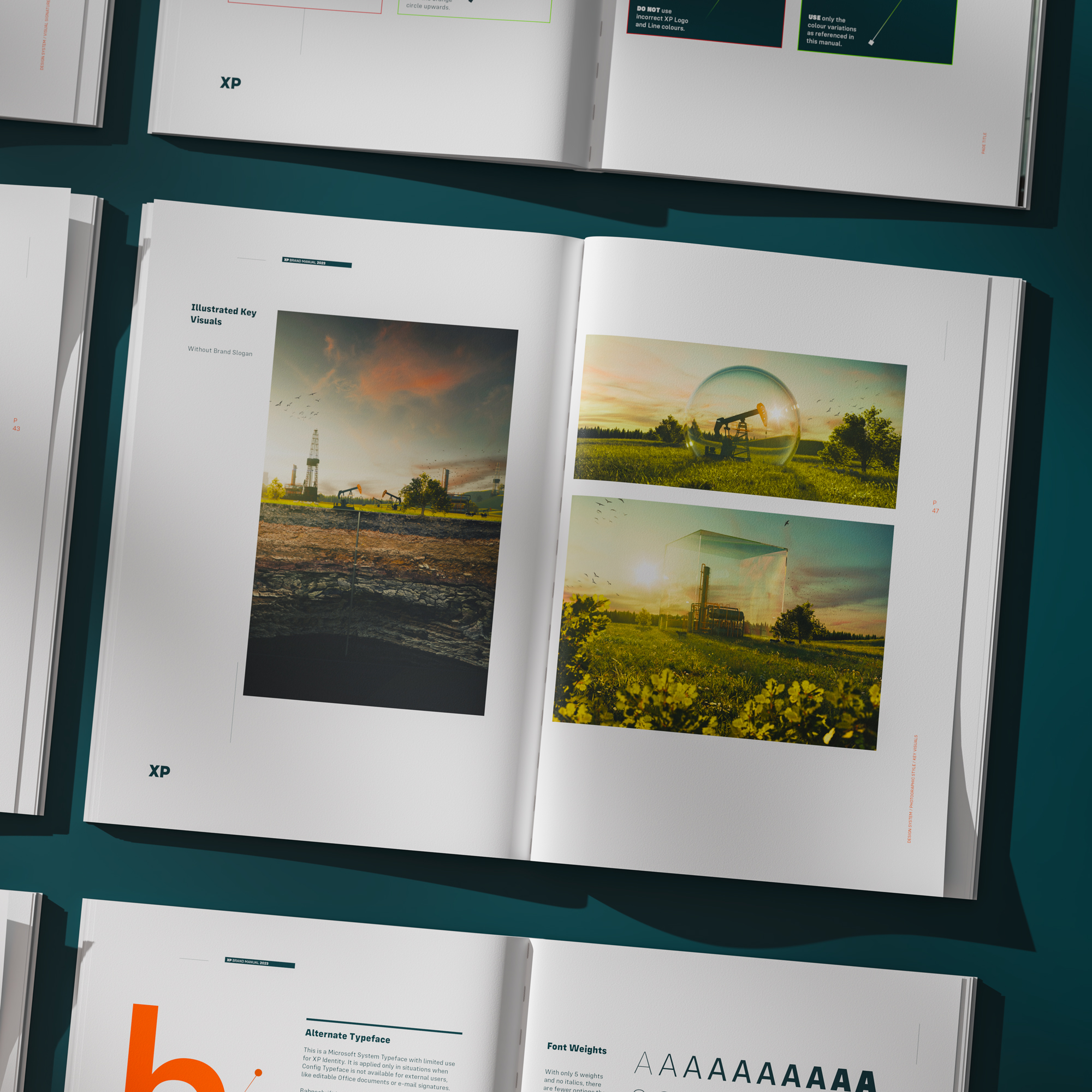
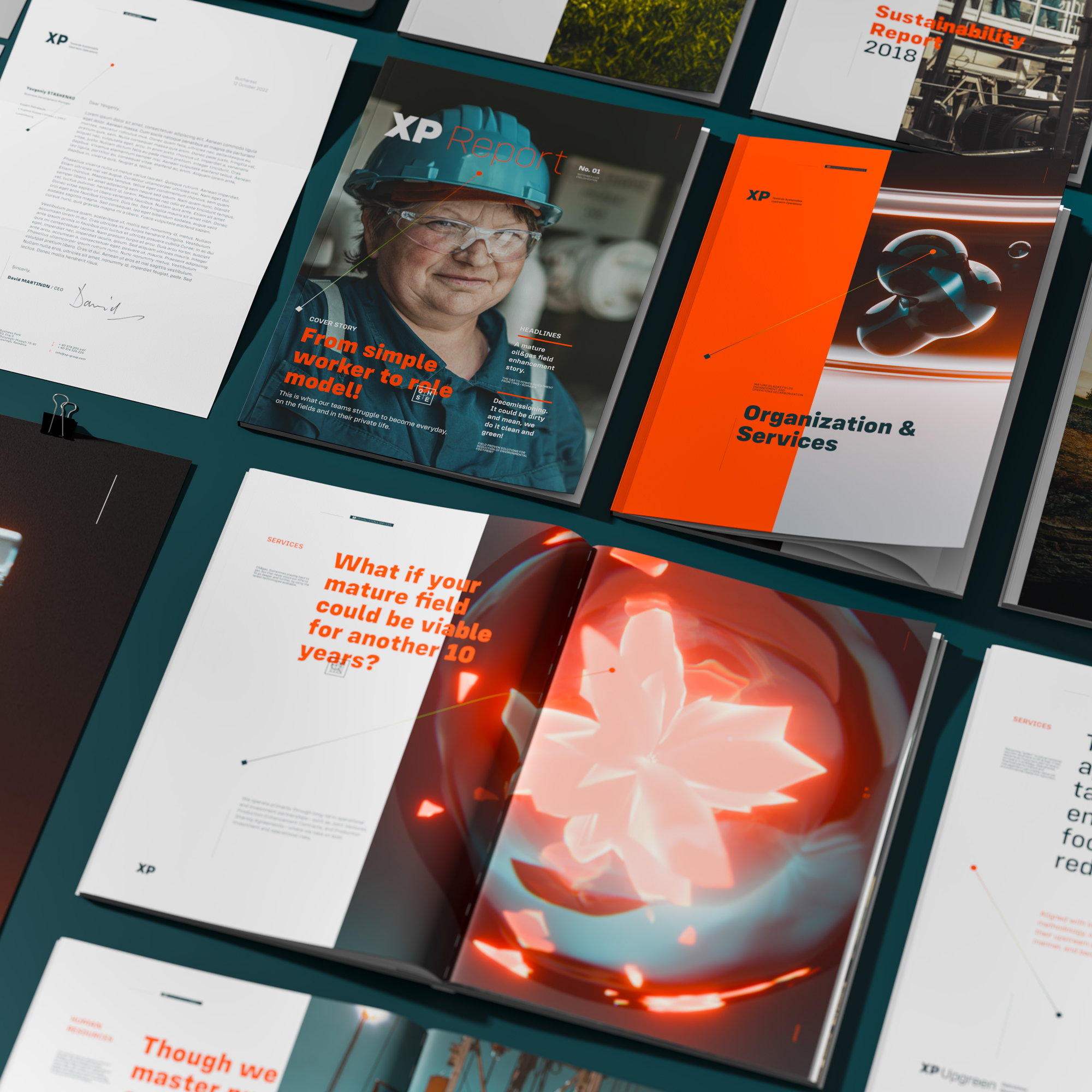
The editorial materials and CGI key visuals developed in Oxygen translated this logic into an expression of what the company was already doing, brought into the right light.
An integral part of the sustainability narrative was the video production “Gas to Power: A Field Enhancement Story”, a filmed case study documenting the actual process of rehabilitating a mature field, from the initial assessment through to the operational results.
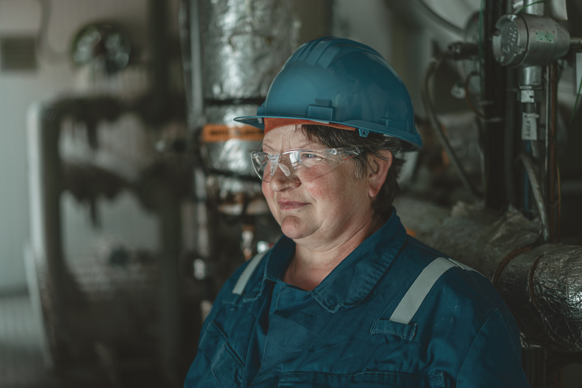
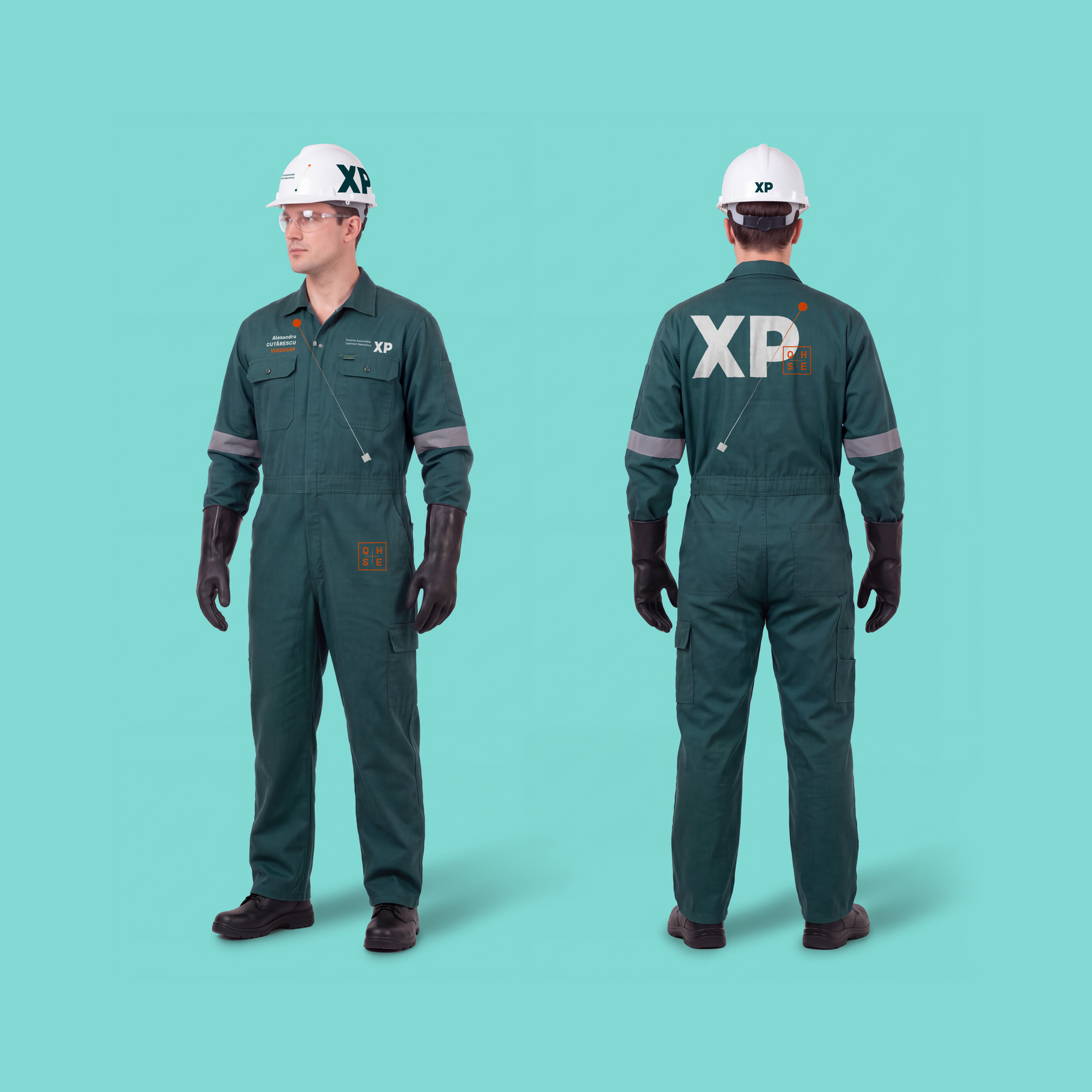
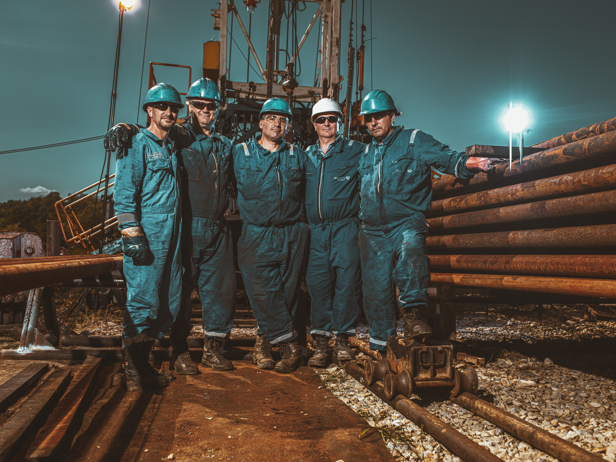
An image library was created through a production photography shoot covering XP’s field operations, equipment, people, and real working environments. Interior and exterior signage across production sites, field vehicles, and staff uniforms were integrated into the same visual system, ensuring brand consistency across all touchpoints.

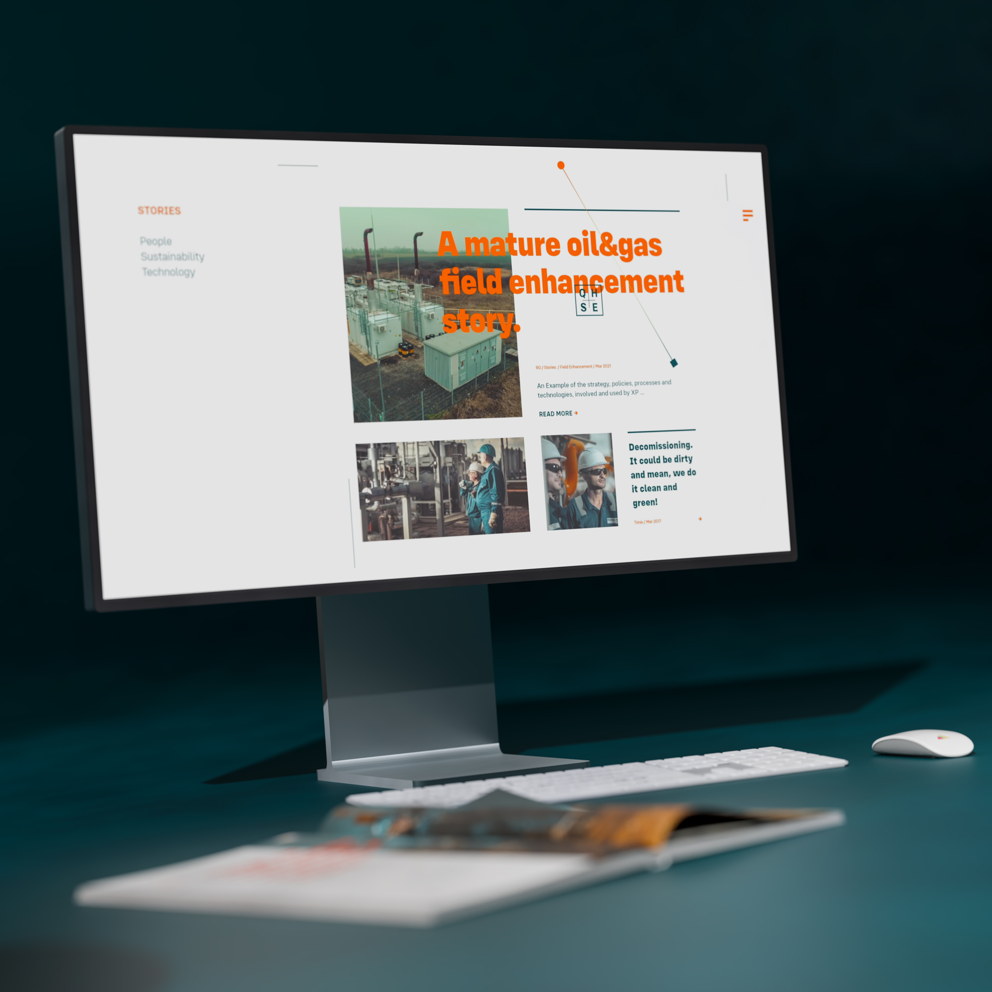
The website, a space for greater clarity
The information architecture followed the strategic logic defined in Fuel: technical expertise, sustainability and international presence, three dimensions presented in the same tone, regardless of which section the user reaches. The design and prototyping followed the visual system built in Spark, ensuring continuity between the offline and digital identities.
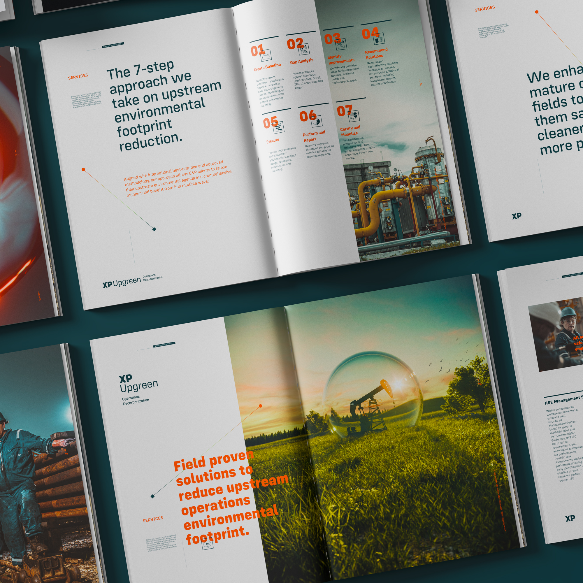
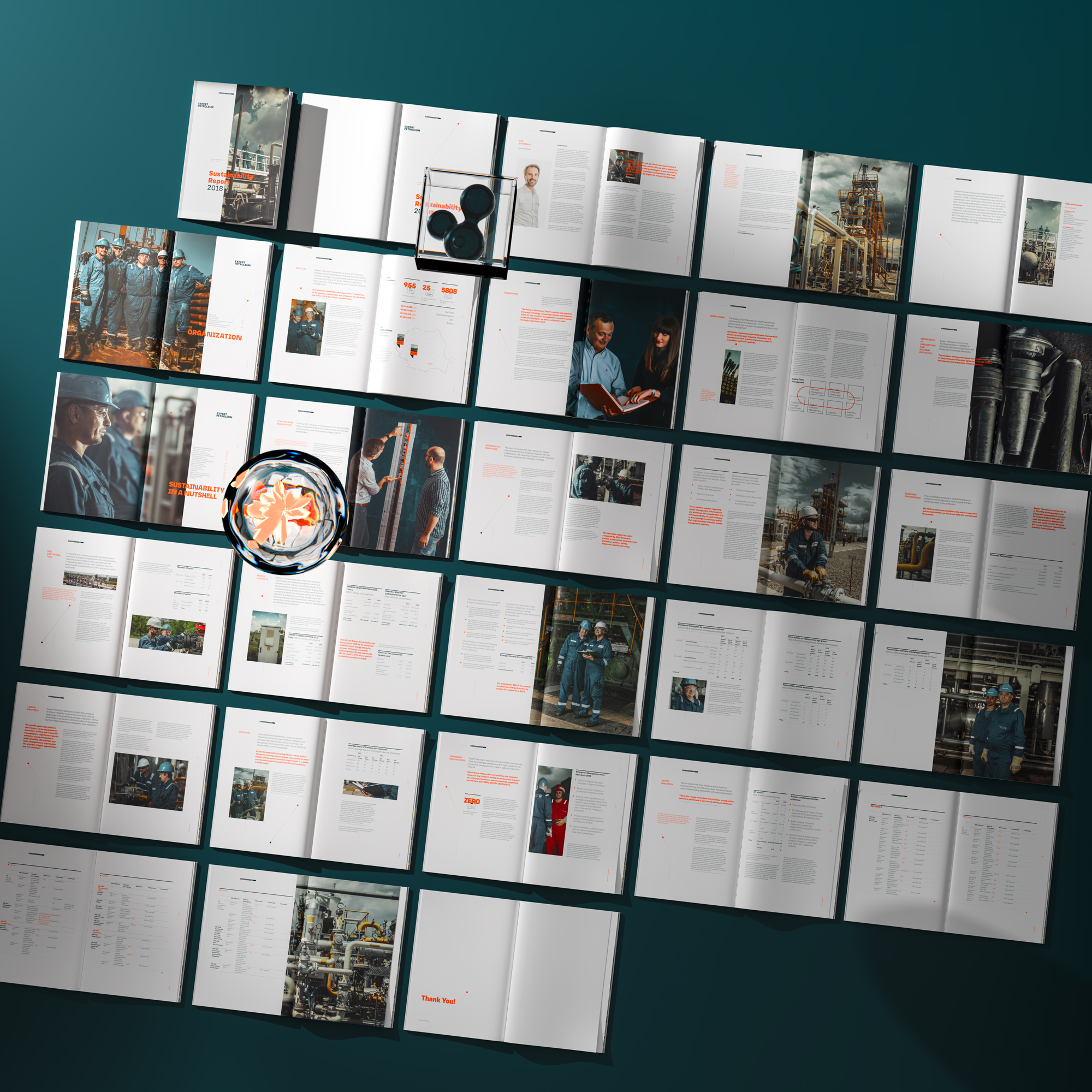
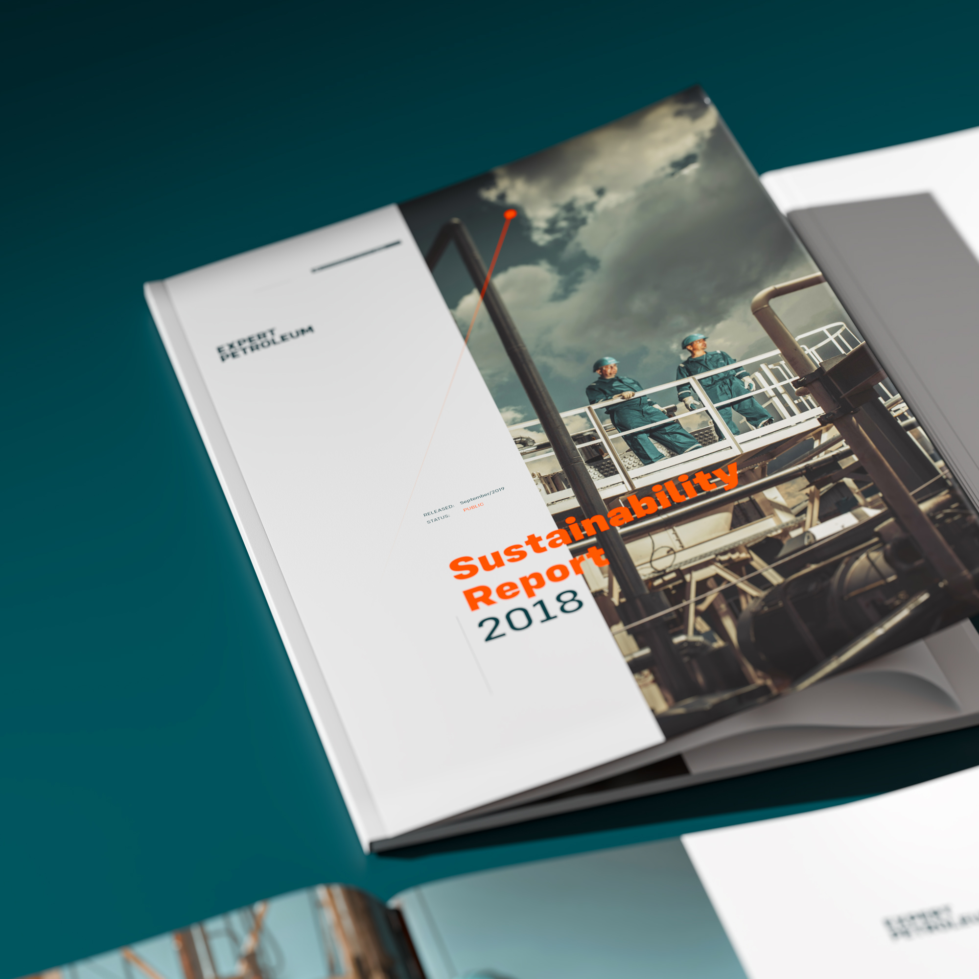
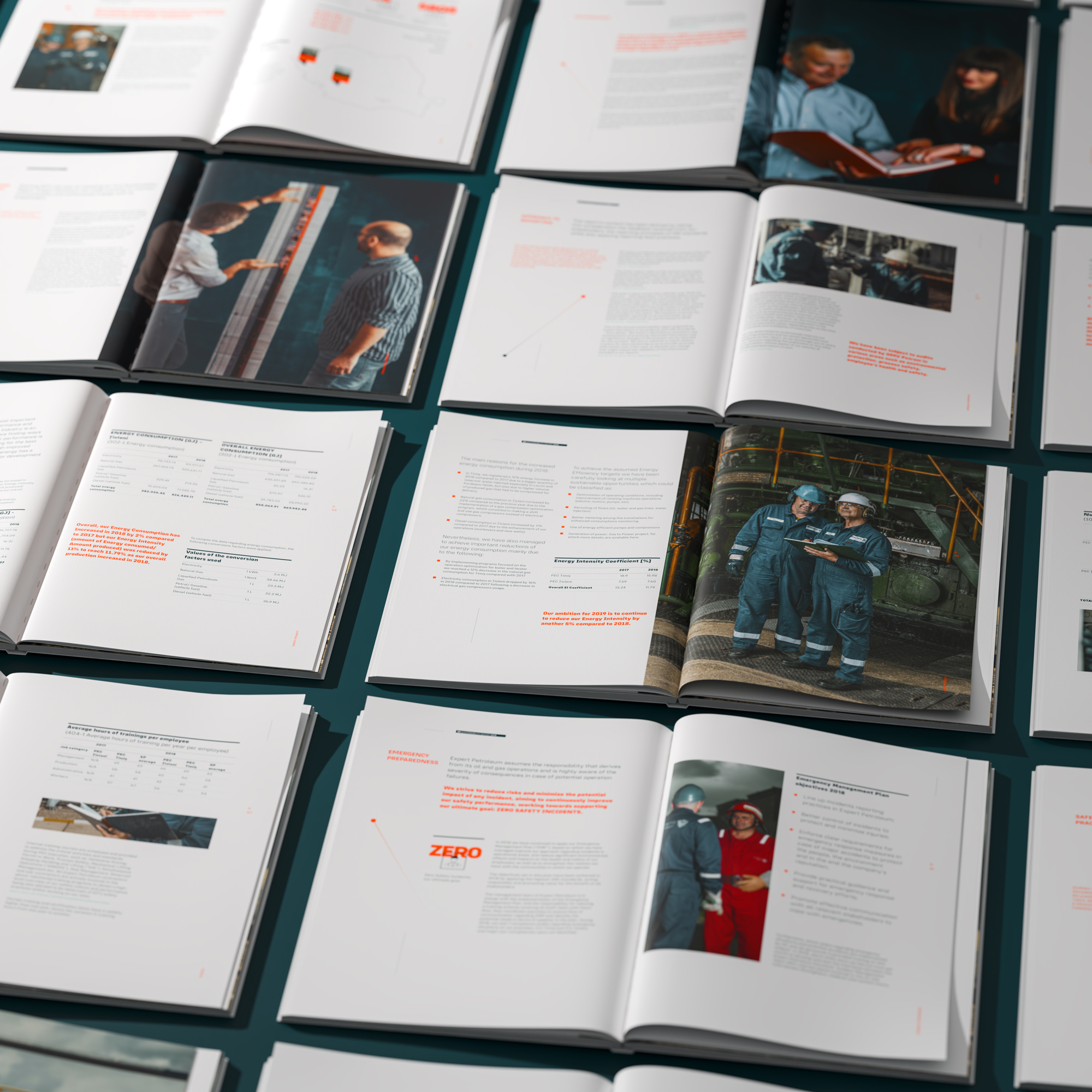
The annual sustainability reports were designed as brand documents articulating the company’s strategic direction to partners, institutions, and the wider community, while presentation decks for keynotes and business engagements were built around a narrative logic adapted to international contexts.
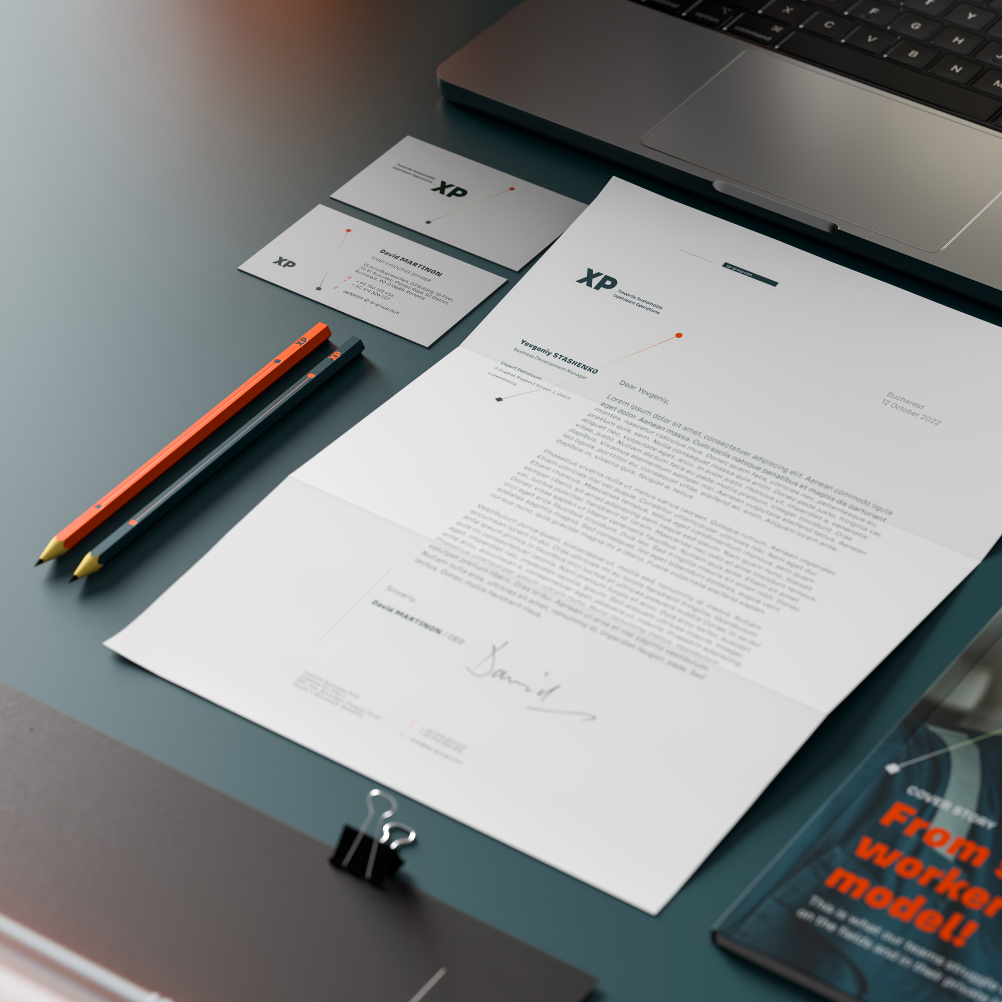
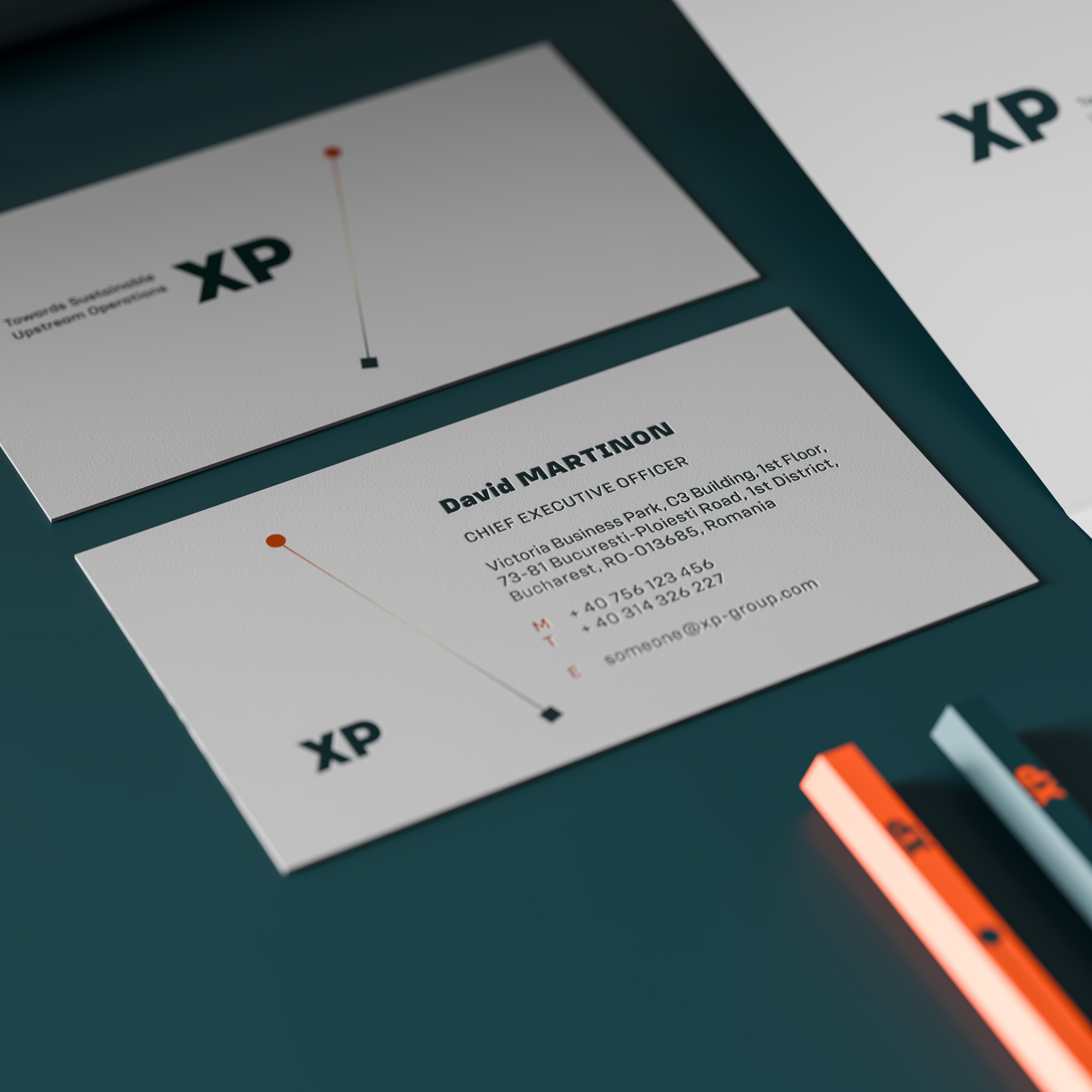
The stationery implementation covered business cards and internal and external document templates.
Twenty years of activity in a demanding industry, with operations across four continents and partnerships with major operators, deserved to be treated as a brand opportunity, to reaffirm the company’s values and communicate the direction of the coming years.
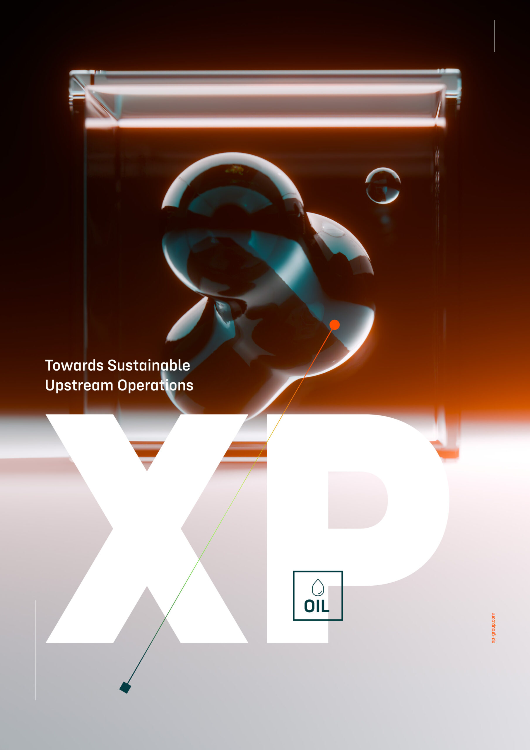
The materials produced (posters, communication materials, digital adaptations) followed the identity system built in Spark, adding a narrative layer specific to the moment, without breaking the brand’s coherence.
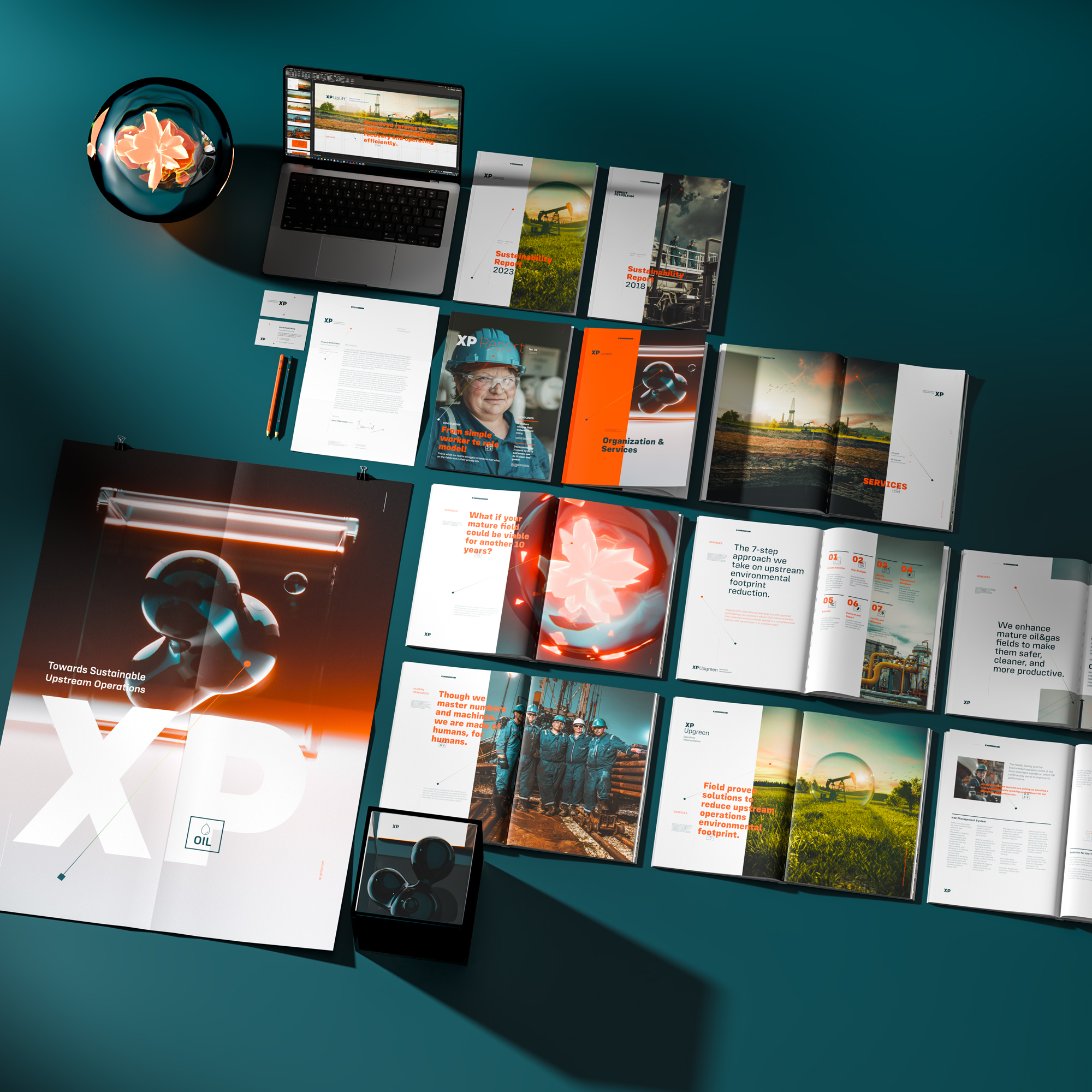
The decision to evolve towards XP, a more compact, more international, more scalable identity, came as a logical consequence of the direction established in 2018.
The XP logo condensed into two letters, both expertise and three deliberate interpretations: Experience, Expressive, Exponential.
The identity system built during the previous stages served as the platform for this transition. It also included a gradual naming strategy, a hybrid period in which Expert Petroleum and XP coexisted, allowing the audience to follow and assimilate the contraction. The logic was simple: when pronouncing the word Expert, the initial E disappears before X. Expert Petroleum becomes XP. And the words carrying the XP particles (eXPerience, eXPansion, eXPloration) served as the first activation messages for the new name, both internally and externally.
Our results and our reputation speak for themselves. But when we go outside, our brand needs to tell a new partner in 10 seconds who we are and what we stand for. The image we want to send is that we are professional, rigorous, innovative, and pragmatic. It worked. We just came back from Abu Dhabi, where we had a presentation, and they understood immediately who we are and what we do.
communication strategy structured around the concept of brand activism: from statements to actions and from standard industrial communication to a brand that behaves like a responsible citizen
Sessions with the XP team, internal guide.
architecture, complete design, prototyping, implementation
brand narrative, editorial content, data visualizations, annual reports, deck presentations
3D images developed in line with the new identity, for thematic campaigns
Coherent implementation of the visual identity in physical space.
Performance reports, optimisation recommendations.
created through a production photography shoot covering XP’s field operations, equipment, people, and real working environments
a filmed case study documenting the actual process of rehabilitating a mature field, from the initial assessment through to the operational results
posters and communication materials for specific contexts
adaptation of the brand system for the anniversary moment, dedicated materials
guidance for applying the identity across corporate and digital materials



This site is protected by reCAPTCHA and the Google Privacy Policy and Terms of Service apply.



Bottled water, driven by social causes.
/
PRODUCTS
2014
Frozen vegetables that shatter the negative perception.
/
FMCG
2024
Architecture shaped by human nature.
/
COMMUNITY
2024
Social app focused on meaningful connections.
/
MOBILE APPS
2026
